
This is not yet another article about the design process. There's plenty of those. In this article, we’ll focus on the specific way we work at Excited.
Certain aspects like consistency, accessibility, and inclusivity are beyond the scope of this article because our approach to these elements aligns with best practices. Instead, we aim to highlight the aspects of our process that are less conventional.
Let’s start from the beginning.

Kick-off Call
All projects begin with a kick-off call. The primary goal of this initial conversation is to clearly understand the requirements and expectations. It's also crucial to figure out the stakeholder structure and identify who is responsible for what.
Whether it’s about creating a new product, supporting an existing one, or redesigning a current product, clients often have a clear vision of how they want their product to look. If they don’t, it’s the designer’s job to help articulate it. And if the vision is lacking, it’s your responsibility to inform them.
Common topics for this conversation include the target audience, key features, and setting the project timeline. However, we don't provide a checklist, as each project has its own specific nuances that no checklist can fully cover. Therefore, when getting ready, we rely on common sense.
{{{{service-card}}}}
Research Phase
Defining Business Goals and Context
The main objective at the first stage is to understand the client's business goals. This conversation sets the tone for the rest of the collaboration, so it’s important to position design as a means of achieving business objectives, rather than something more superficial.
For instance, for technological startups that naturally entail lots of risk, it's common to start with either mvp, or poc or a prototype, depending on the goals and types of risks.
It's important to define how the product will work, what value it will bring to users, and in what context it will be used.
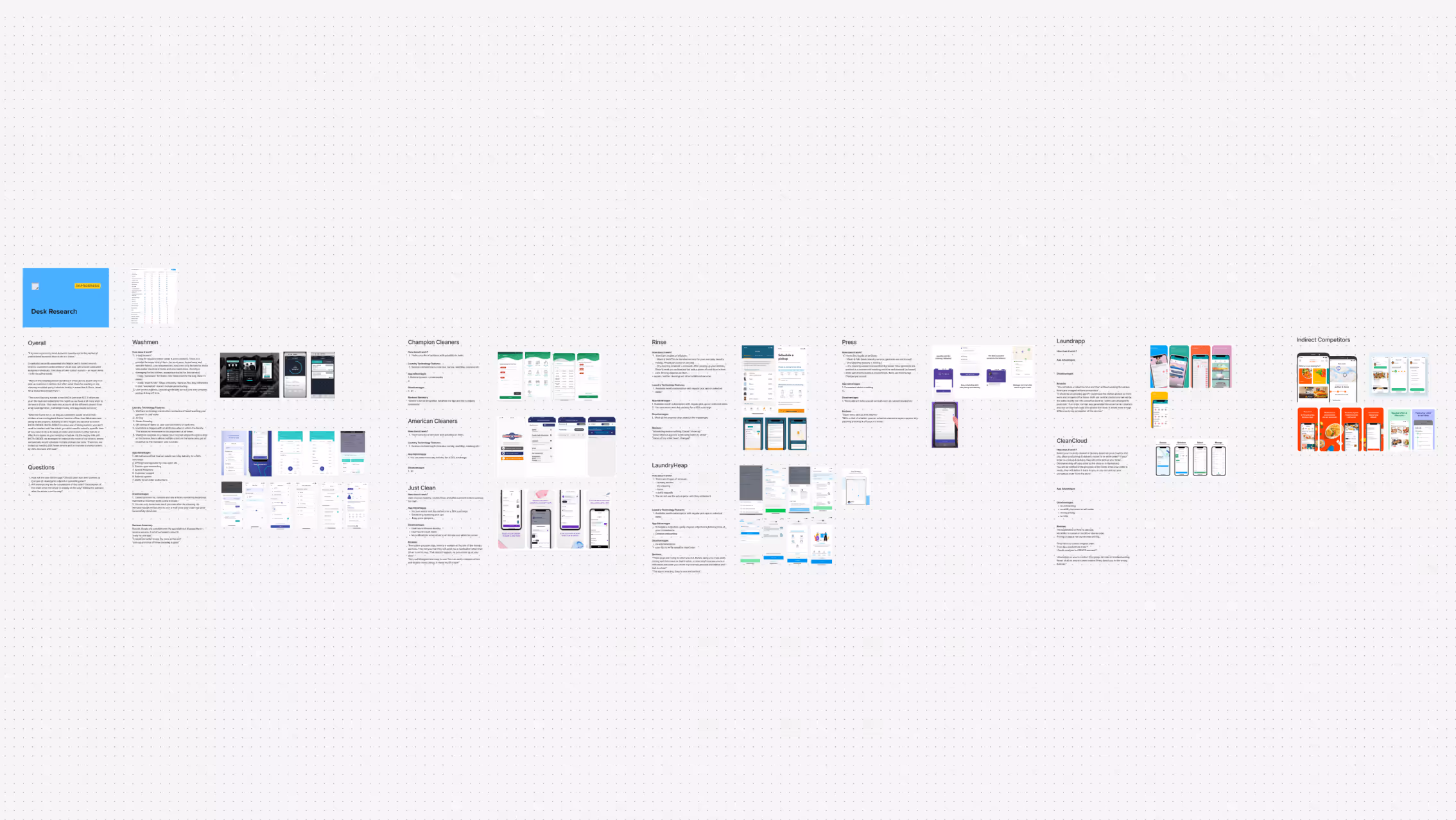
Desk Research and Analysis
Before creating any artifacts, we investigate what research activities have been conducted before us. This activity is also sometimes referred to as secondary research. Often, previous work can be reused, speeding up the designers' adaptation to the project.
In addition, we conduct user research to gain a deeper understanding of the needs and behavior of the end users. All results are documented in Figma as tables, presentations, or notes with comments.
User Flows
Before creating a design concept, we develop user flows based on the information provided by the client and the research results. This step allows us to visualize the user’s path through the product, optimize their interaction, and identify possible obstacles or unnecessary steps that could negatively impact the user experience.
However, this step is not always mandatory. User flows are often skipped when the product or app’s functionality is simple and well-defined, or when the client already has a clear understanding of user interaction logic. If all key aspects are known in advance, and the usage scenarios don’t contain complex elements, we can proceed directly to the design phase.
For projects, where UX garners significant strategic value, we consider developing UX strategy, so that our activities closely align with the business goals.
We emphasize that the design process is not carved in stone; it's driven by common sense. Our task is to produce value, not just artifacts.
Wireframes
We create wireframes when there are much that is unknown. Wireframes help us iteratively define how different functional elements of the app work together and visualize user interactions with the product without too much detail. Low-fidelity wireframes simplify the planning process and allow for quick testing of ideas.
However, if most of the product’s functional requirements and elements are already clear, or it’s a redesign or maintenance of an existing project, wireframes may not be necessary. In such cases, we can move directly to high-fidelity design, focusing on the visual aspect and final implementation.
{{case-study}}
Moodboard + Visual Design Concept
At this stage, we’re not just gathering beautiful design elements; we’re creating a unique visual style and language for the product that reflects the brand's individuality and character. Our goal is to ensure that the visual style not only looks appealing but also harmoniously conveys the company’s values and resonates with users.
We start with an in-depth analysis of the brand: its positioning, target audience, and business goals. This helps us better understand what visual solutions will best convey the essence of the product and resonate with users. If necessary, we conduct a Brand Workshop with the client to define the direction more clearly.
Then, we choose a few key screens, such as the homepage or the main action screen, and create a moodboard. This can include references, color palettes, typography, illustrations, photos, and more. At this stage, it makes sense to focus on details like button rounding, background textures, or the use of illustrations, ensuring all elements emphasize the brand's character.
Depending on the project, we usually offer 2-4 design options. Each reveals different aspects of the brand’s visual language, allowing the client to see how their product might look in various versions and choose the one that best matches their vision. After the presentation, we discuss the options with the client and make the necessary adjustments.


Product Design
After approving the visual style, we proceed to design the entire platform. At this stage, a design system is created in parallel, which includes all key interface elements with explanations on their use, as well as prototypes that facilitate the design handover to developers. Prototypes also give clients a chance to see how the product will function in real-world scenarios.
Additionally, it is at that point when we start thinking about usage metrics such as retention.
For markets requiring multiple language considerations (for example, English and Arabic), we also design key screens for each language version, accounting for text direction and other specific features.
We don’t forget about dark mode, which is available in many applications today. Users can easily switch between light and dark themes. Dark mode is considered from the beginning as part of the overall design system, making it easy to adapt the interface to different modes (light and dark) using tools like Figma Variables.


Usability Testing
The next step in the design process is usability testing. We usually conduct testing when there are new, complex, or critical functional elements that may impact the overall user experience. This allows us to identify potential issues at the design stage and make necessary adjustments before development begins.
It’s important not to overload testing with unnecessary details, keeping sessions compact and productive. Users can become fatigued, so it's recommended to limit the duration of each test to about an hour.
When does it make sense to do unmoderated sessions?
Unmoderated testing is great for quick iterations or testing small parts of the interface. It’s also effective when you need to get more feedback in a short time. However, for more complex or critical functional parts, we recommend conducting moderated testing.
After the testing is completed, we prepare a summary that includes:
- Identified usability issues
- User feedback and recommendations
- Notes from test sessions
- Suggestions for changes in design or functionality based on the test results
Preparing for Launch
This stage is often overlooked, with the assumption that product designers are only concerned with the in-app user experience. However, we pay great attention not only to the existing user experience but also to attracting new users. Therefore, we help create elements that make your product attractive in the market and ensure effective interaction with potential customers.
The final step is creating visuals for the App Store and Google Play Market to ensure your product looks professional and engaging on download platforms.
Additionally, if needed, we create supplementary visual materials:
- Covers for social media
- Banner designs
- Even promo videos demonstrating your product in action

Bottom line
In today's fast-paced design landscape, it's easy to fall into the habit of checking boxes and following rigid processes. However, truly successful projects are born from flexibility, experience, and applying common sense. While frameworks, phases, and tools play their part, no two projects are identical, and they shouldn’t be treated as such.
By prioritizing the unique context of each project and leveraging expertise to make informed decisions, teams can create solutions that genuinely add value. Instead of rigidly adhering to steps for the sake of completion, it’s critical to stay agile, think critically, and always keep the bigger picture in mind.
We helped our client raise $50 mil. and win 2 design awards. Here's how.
Service short description