
Designing a banking experience for the whole family

Mecard

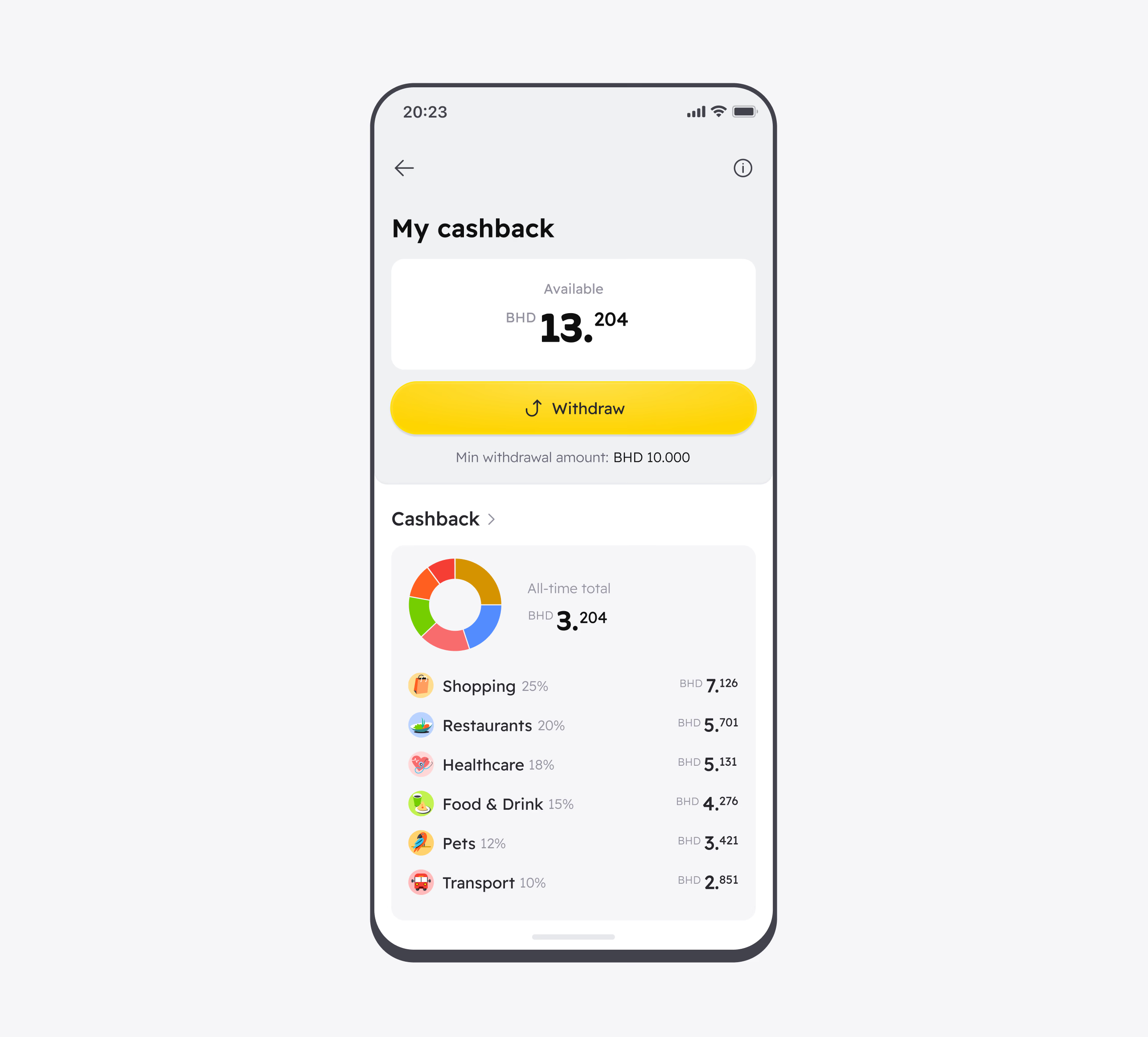
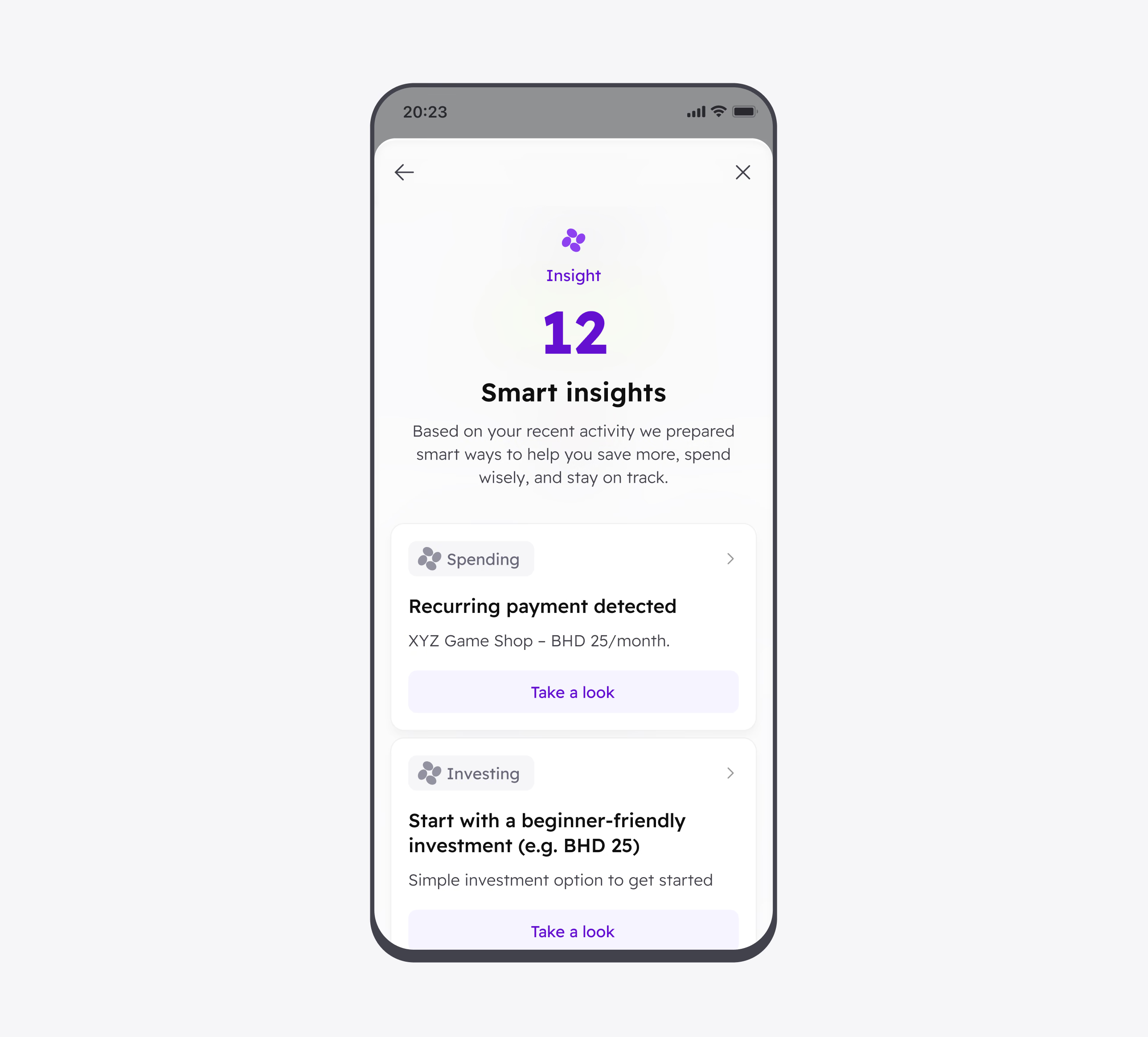
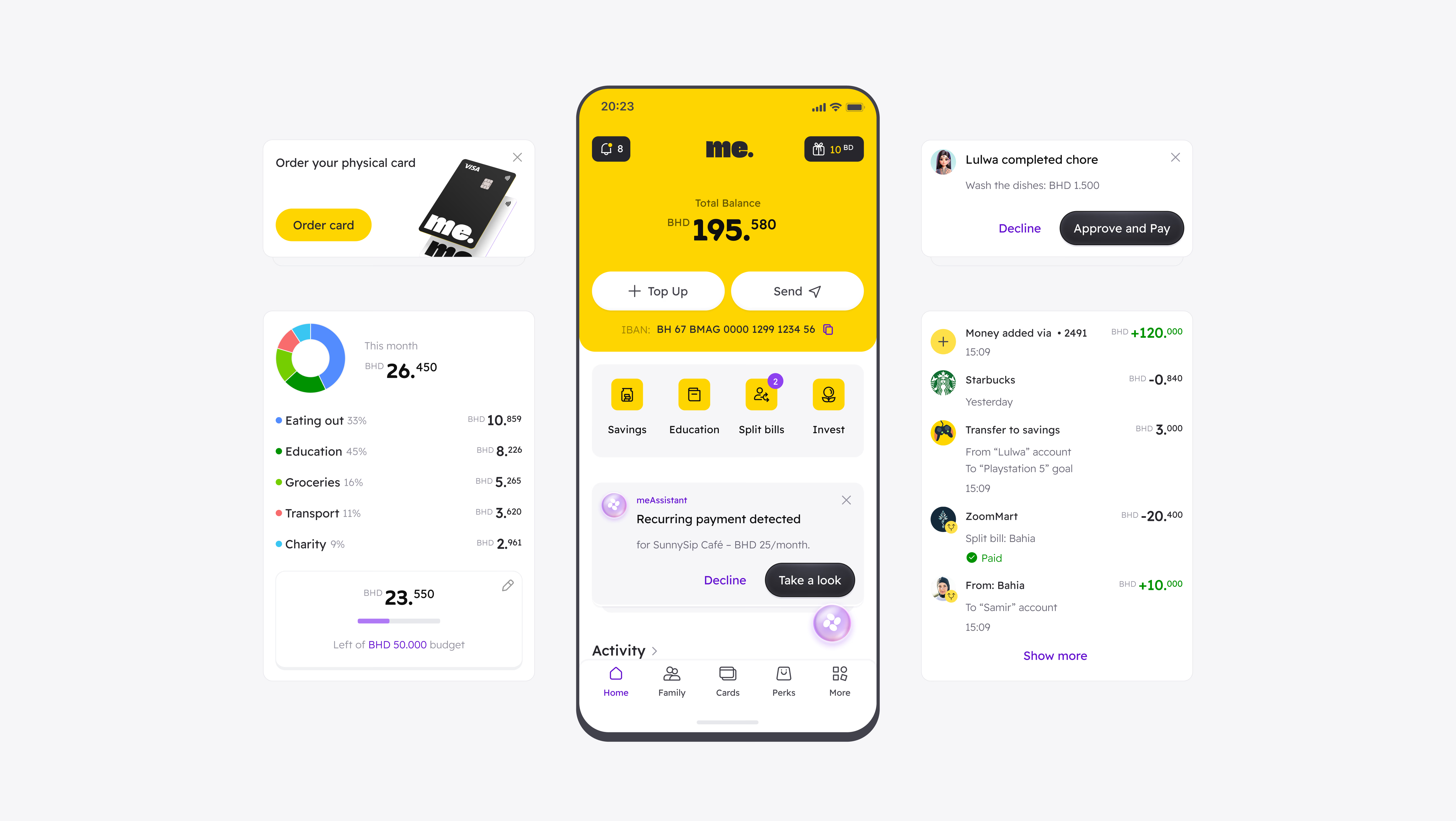
MeCard is a family banking platform for parents and children. What began as a pocket-money app expanded into a broader ecosystem with cashback, AI-powered spending insights, savings goals, bill splitting, investments, chores, expense tracking, and partner perks.

Excited joined when the client had only basic wireframes and no established brand or visual direction. We designed both adult and children’s apps, covering UX, UI, the design system, brand identity, and a mascot for the kids’ experience.

Contribution

Mobile app experience
Branding
Brand Illustrations
Launched Website

Location

Bahrain

Duration

Ongoing

Results
A complete family banking ecosystem from scratch
Client's feedback

Emad AlKooheji
Co-Foudner, me

We’re impressed with how they engage with the project. Excited works as if they’re part of our team.

Client's avatar
Emad AlKooheji
Co-Foudner, me

Mobile App

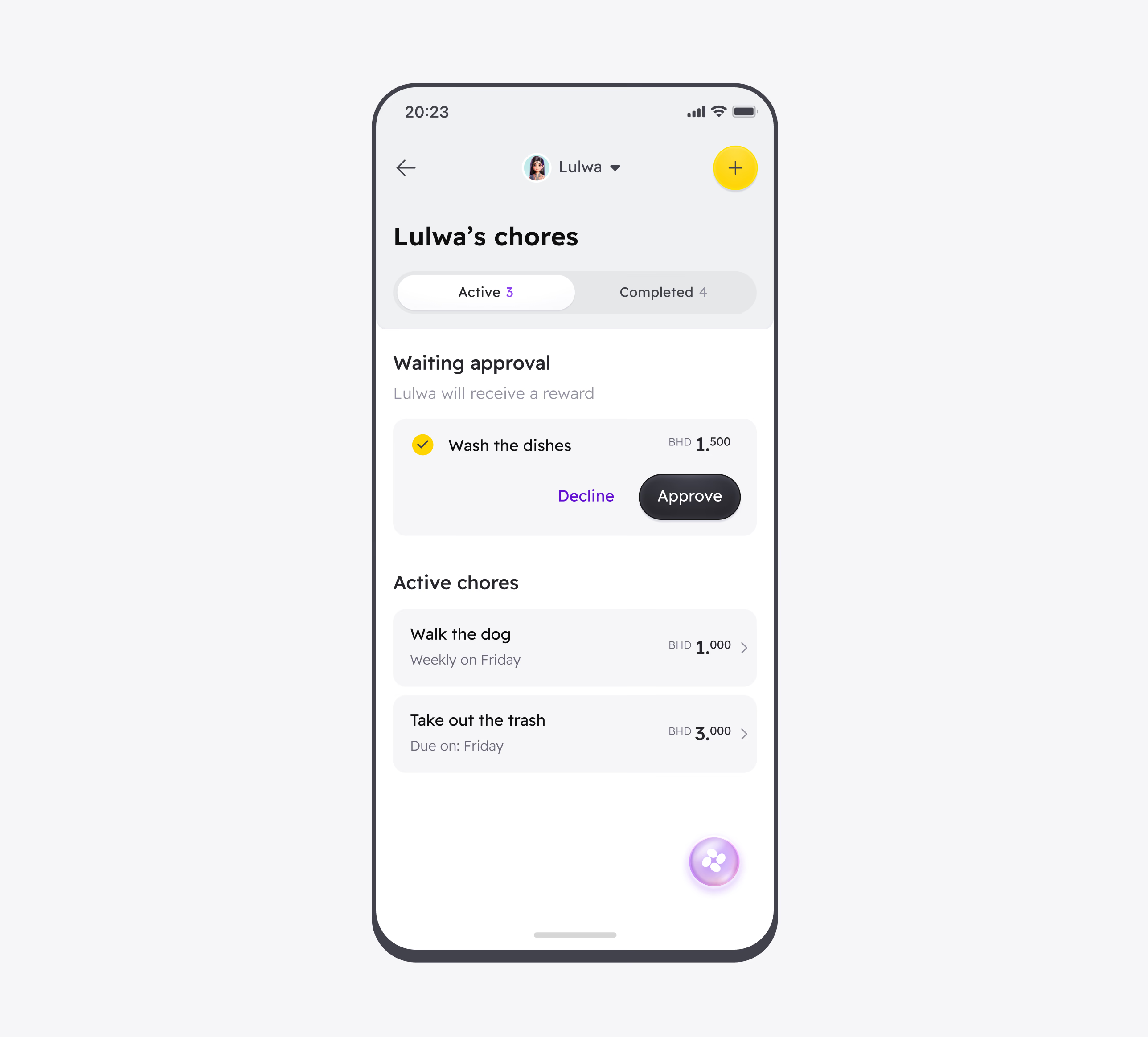
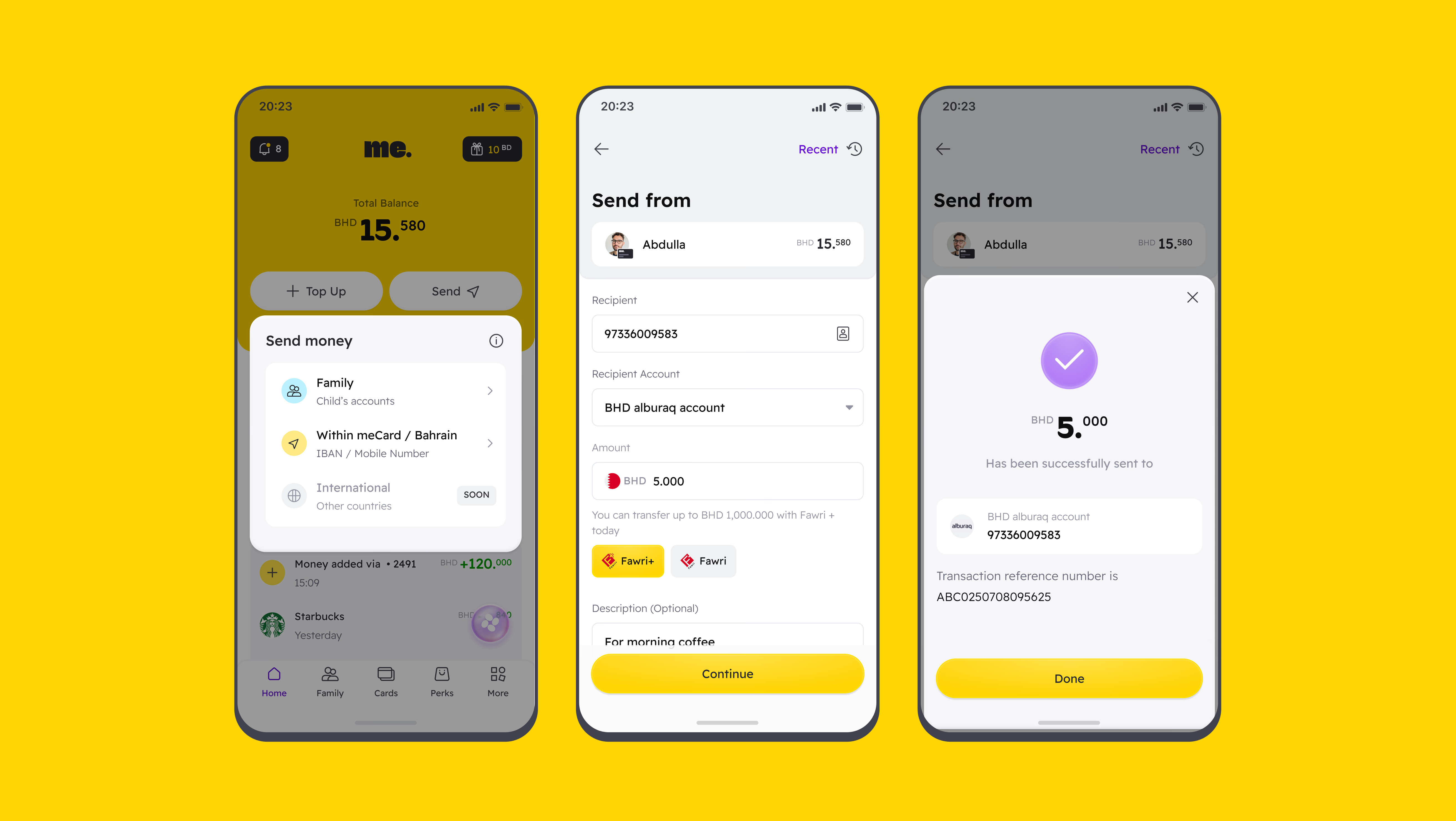
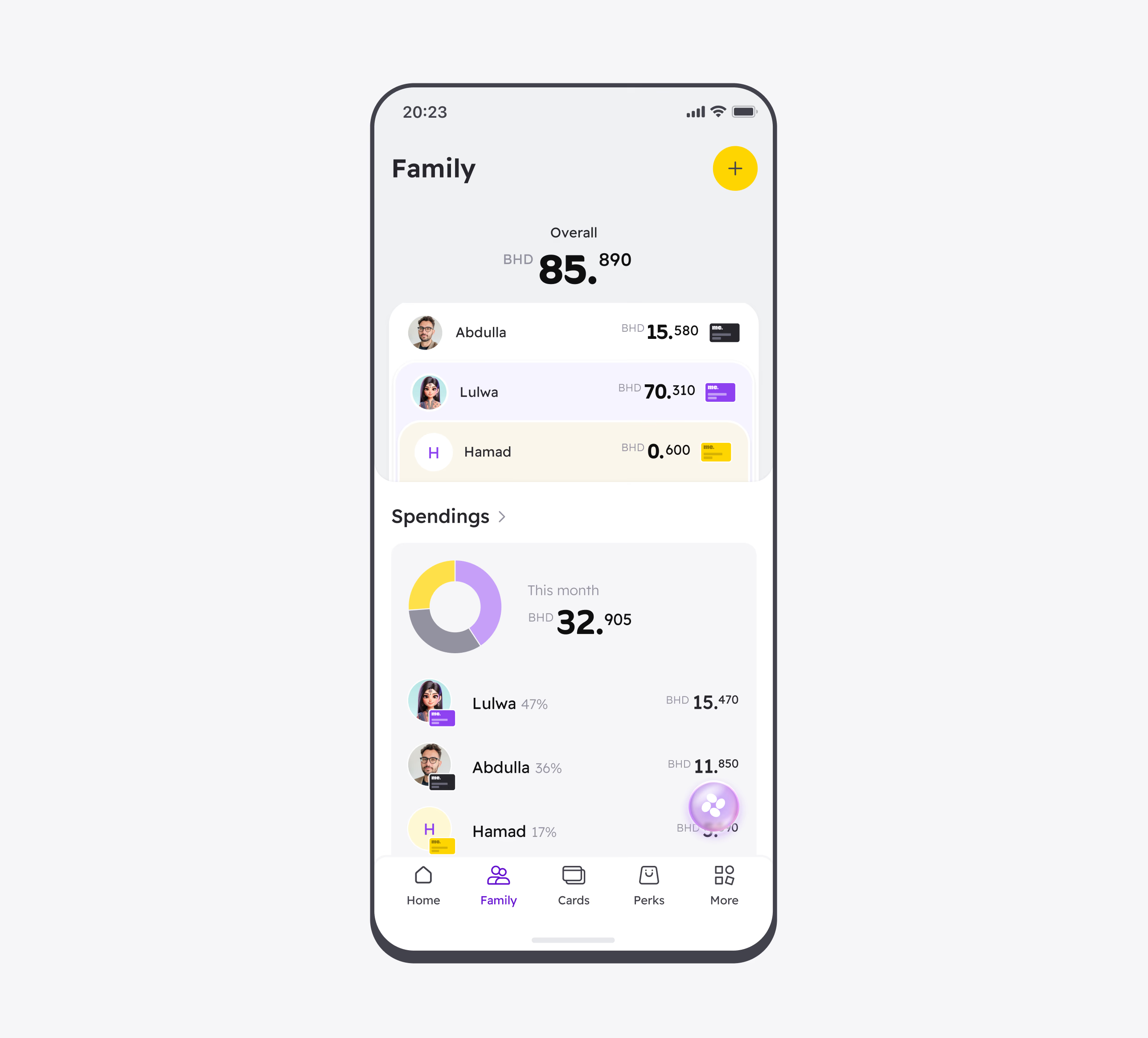
MeCard consists of two interconnected mobile apps: one for adults and one for children. Parents can manage allowances, track spending, assign chores, and support savings goals, while children get a simpler, more engaging way to understand and manage their own money.
Mobile app (Children)

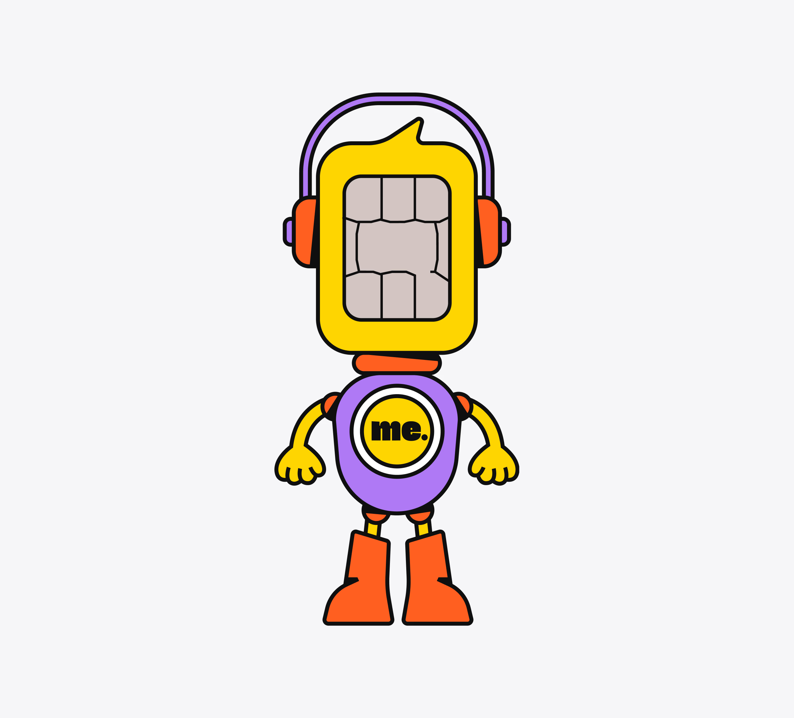
The children’s app uses bold colors, friendly illustrations, and playful interactions to make banking feel approachable. Quizzes, rewards, achievements, and a mascot turn financial education into a more engaging experience.

Website

The website design uses bold typography, spacious layouts, and focused product visuals to simplify a complex AI banking offering. A restrained interface, supported by vibrant purple and yellow accents, creates a confident visual identity while keeping the content easy to navigate.

Logotype

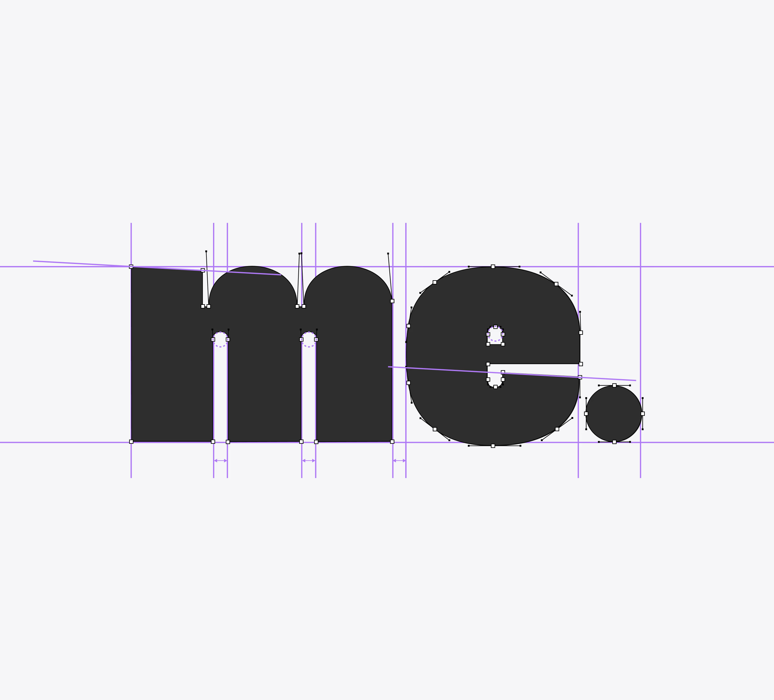
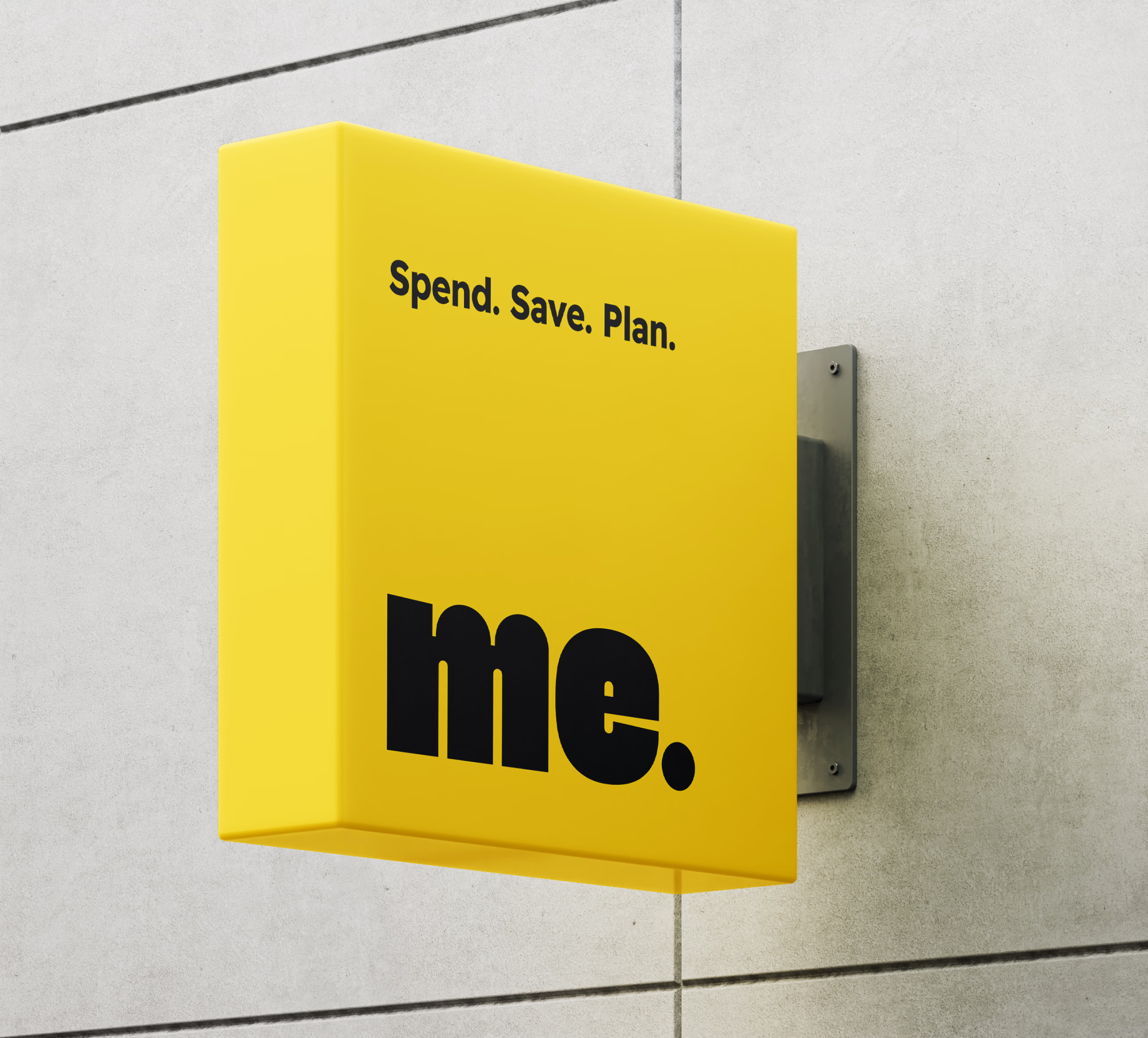
The adult-facing logo uses a heavy, compact wordmark that feels confident, modern, and easy to recognize at any scale. Its simple structure works consistently across the app icon, payment cards, and other digital touchpoints.

Logotype (Children)

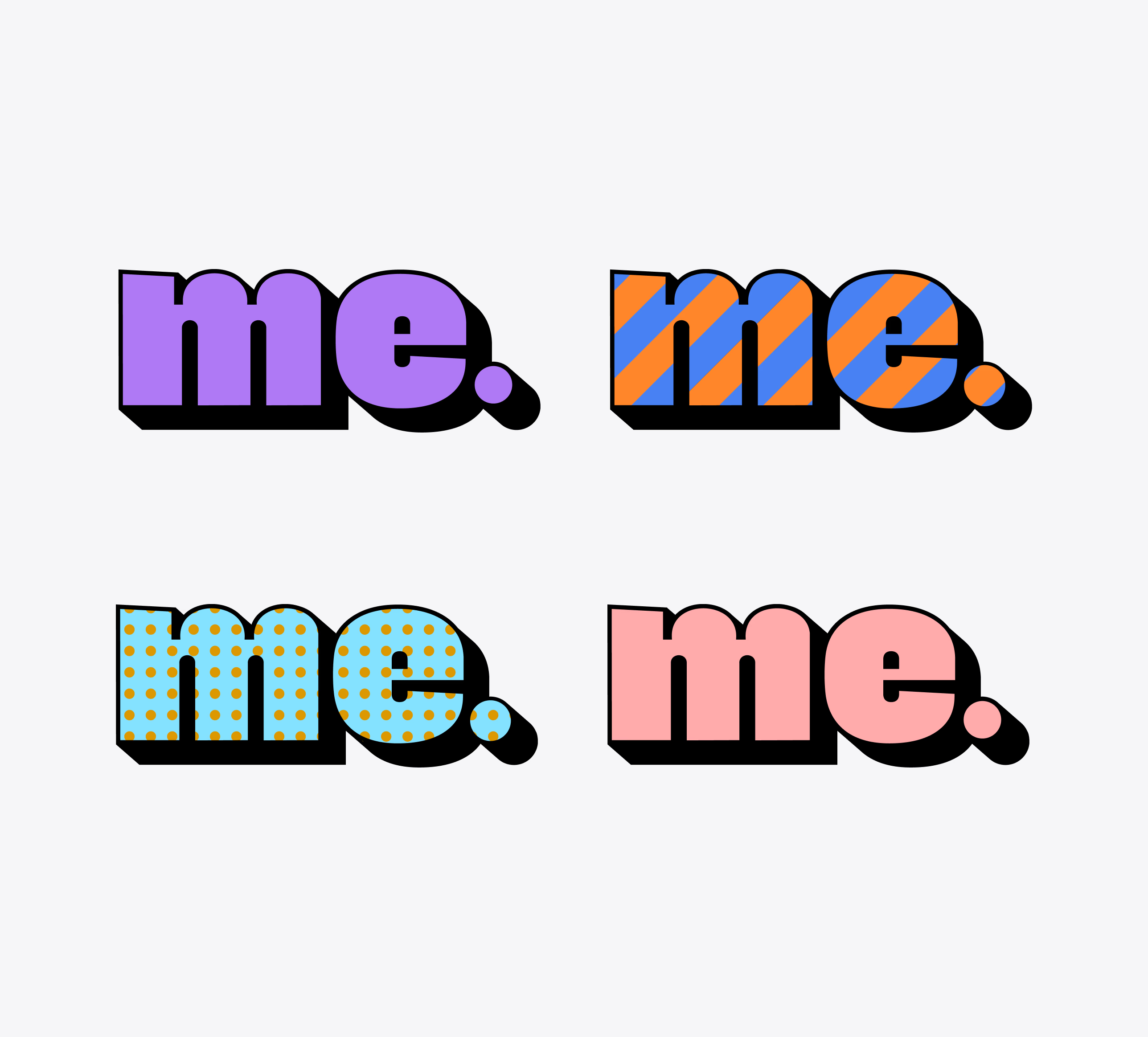
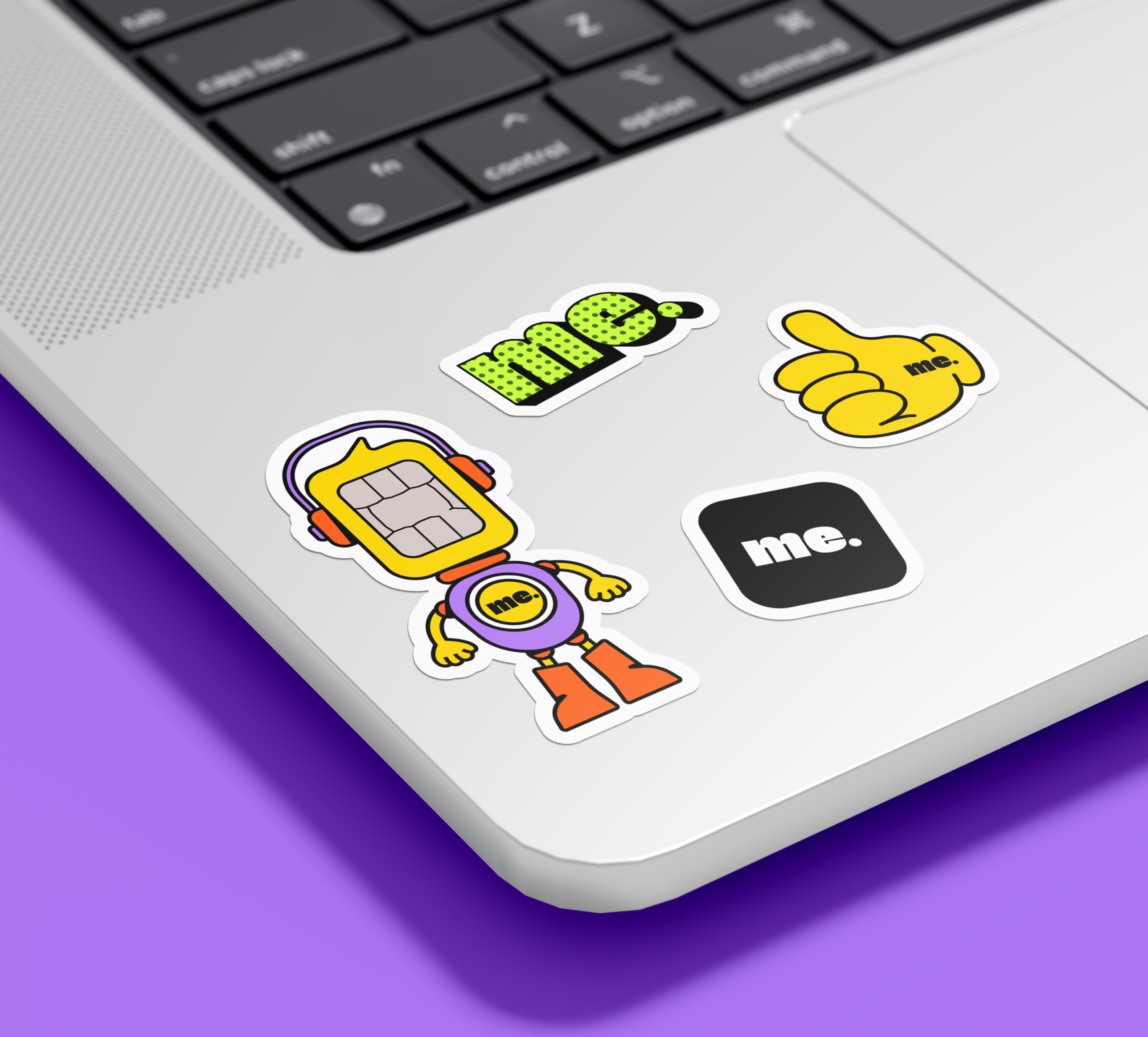
The children’s logo builds on the same wordmark with a bold shadow, brighter colors, and playful patterns. This keeps the two products visually connected while giving the kids’ experience a more expressive personality.

Mascot

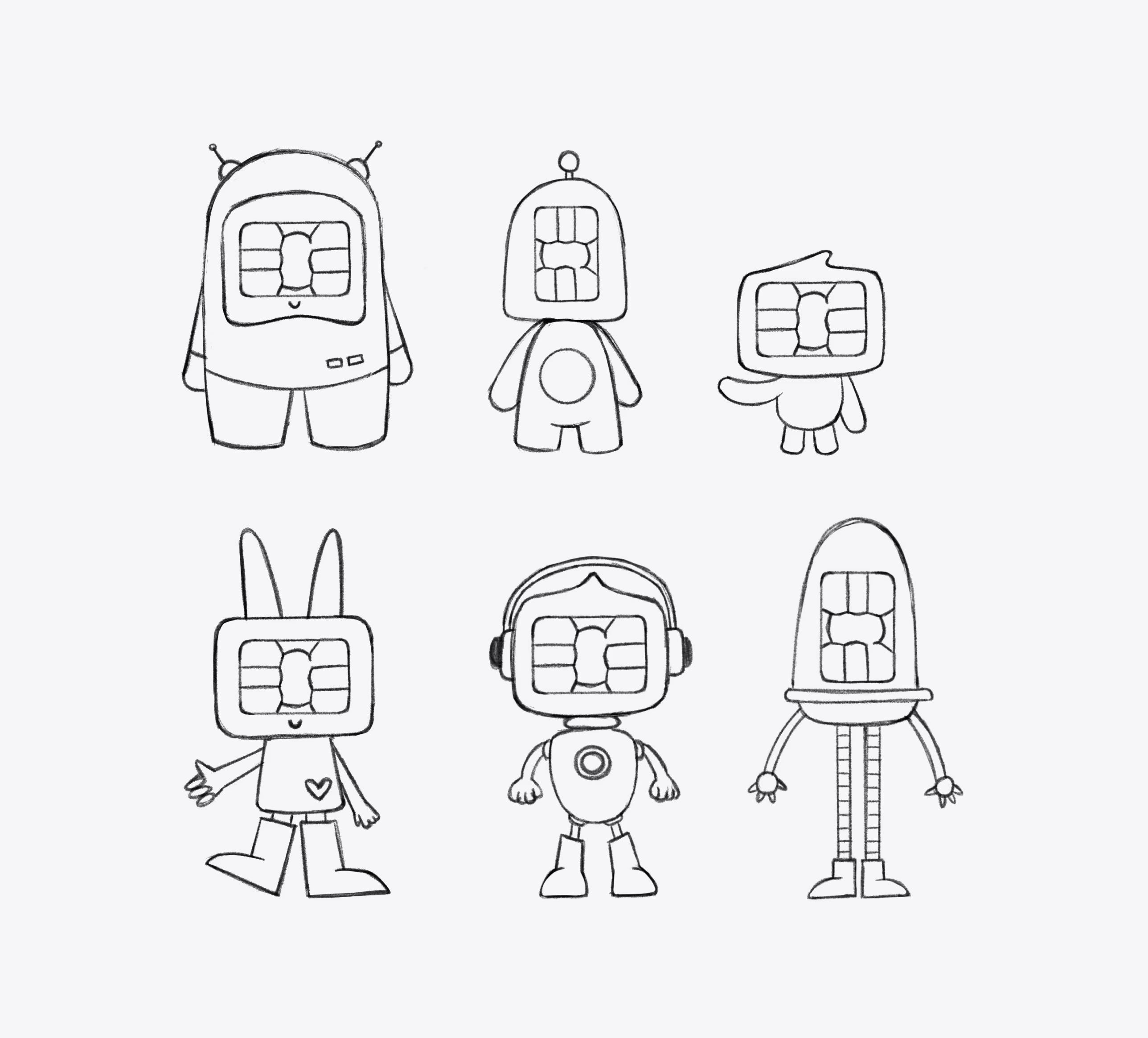
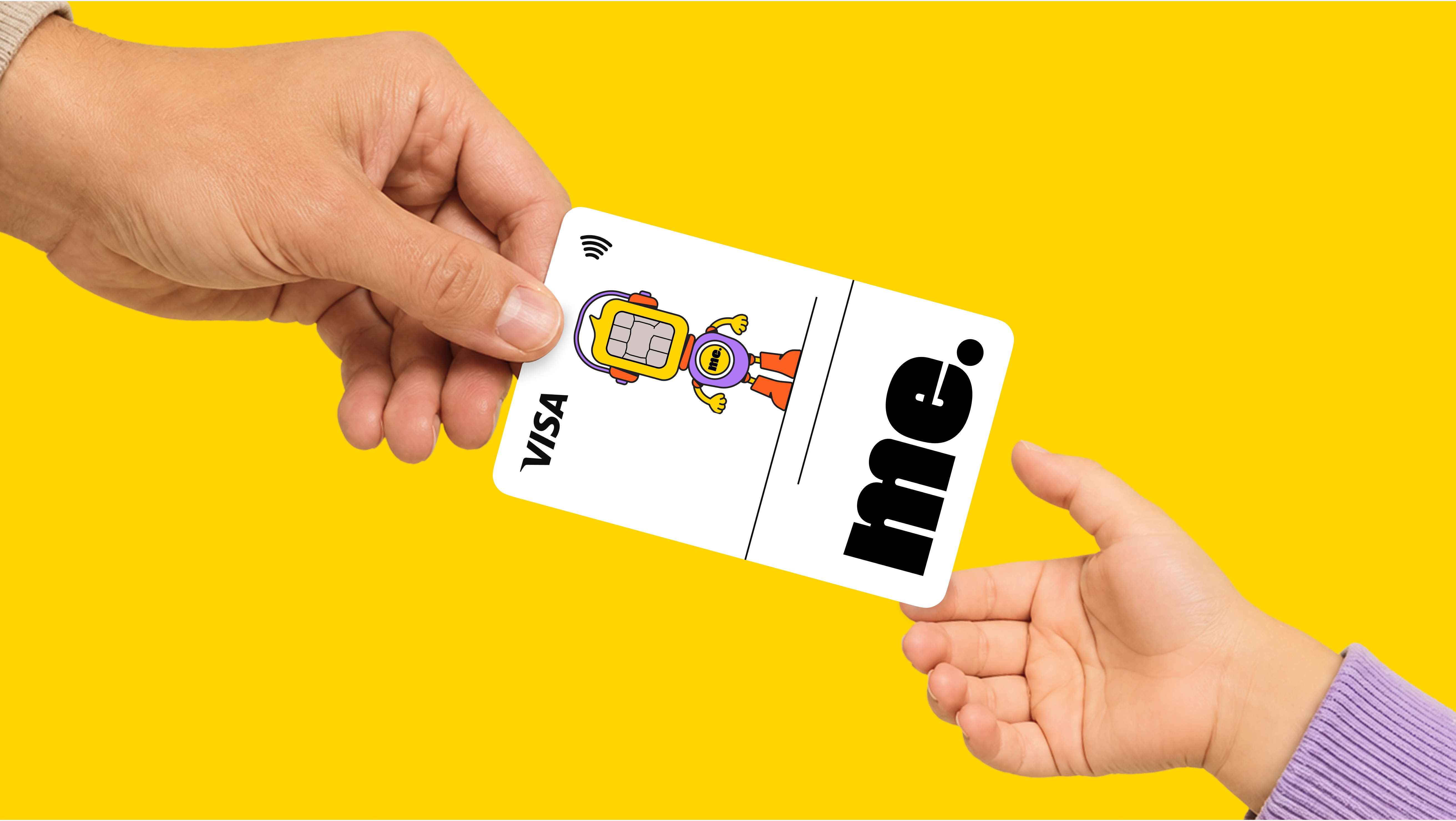
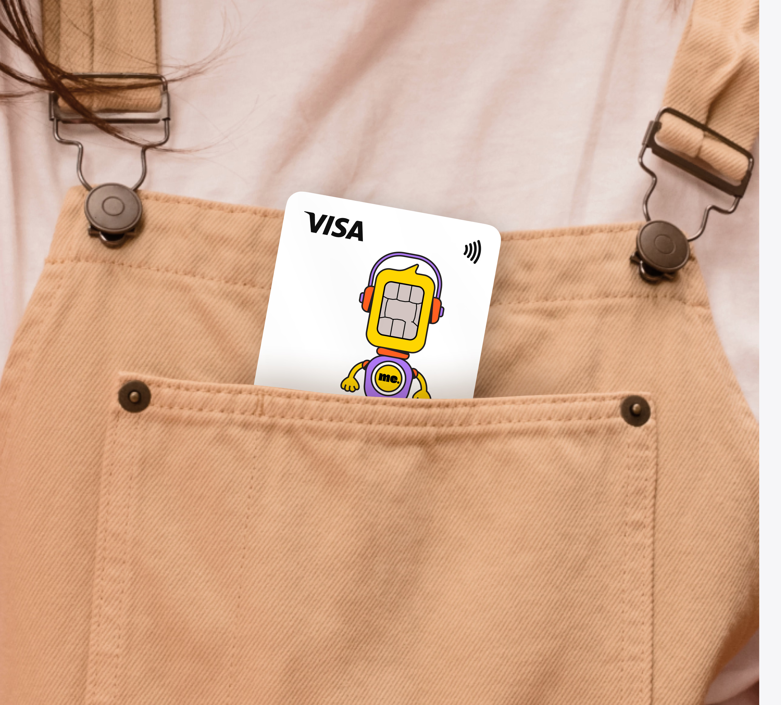
We explored several directions before creating a friendly robot inspired by the shape of a bank card and its chip. The mascot gives the children’s experience a recognizable character and extends naturally across the app, payment cards, and other brand touchpoints.

Card Design

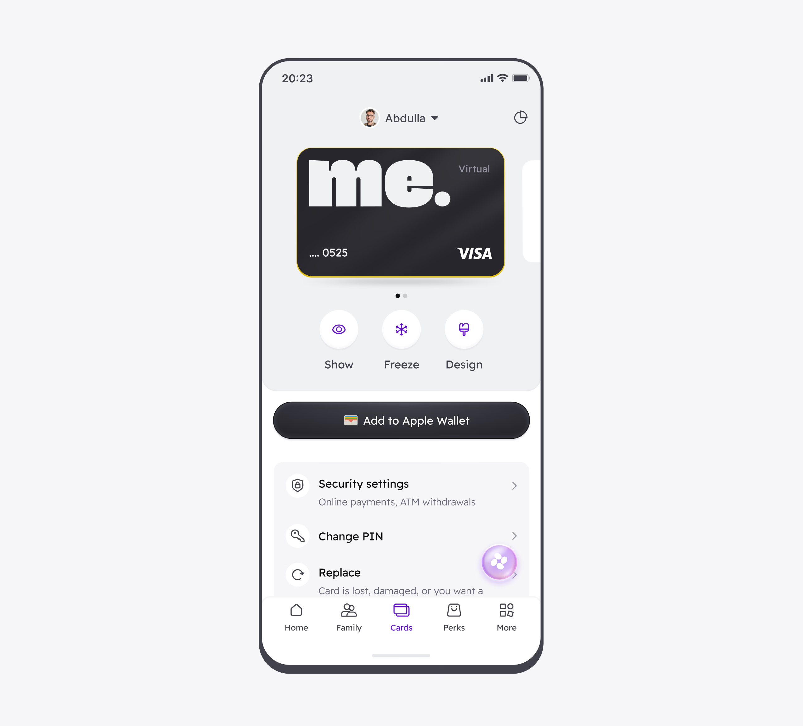
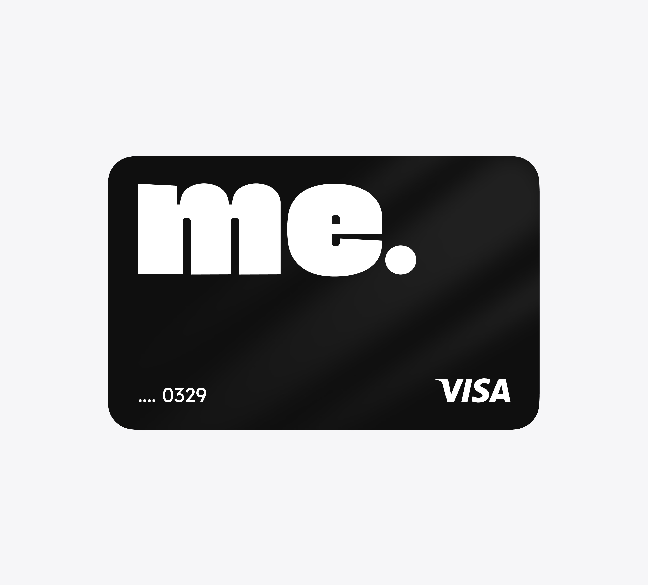
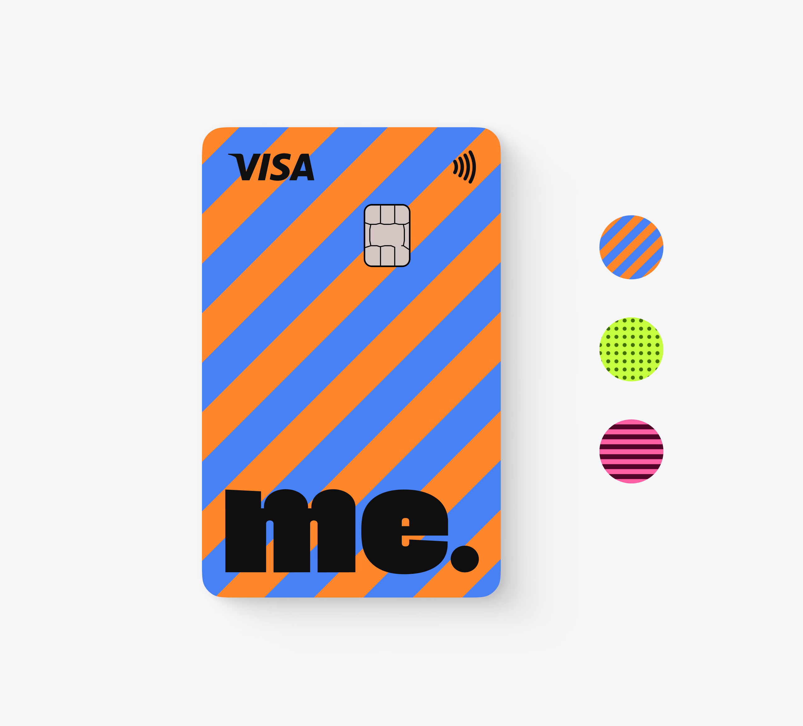
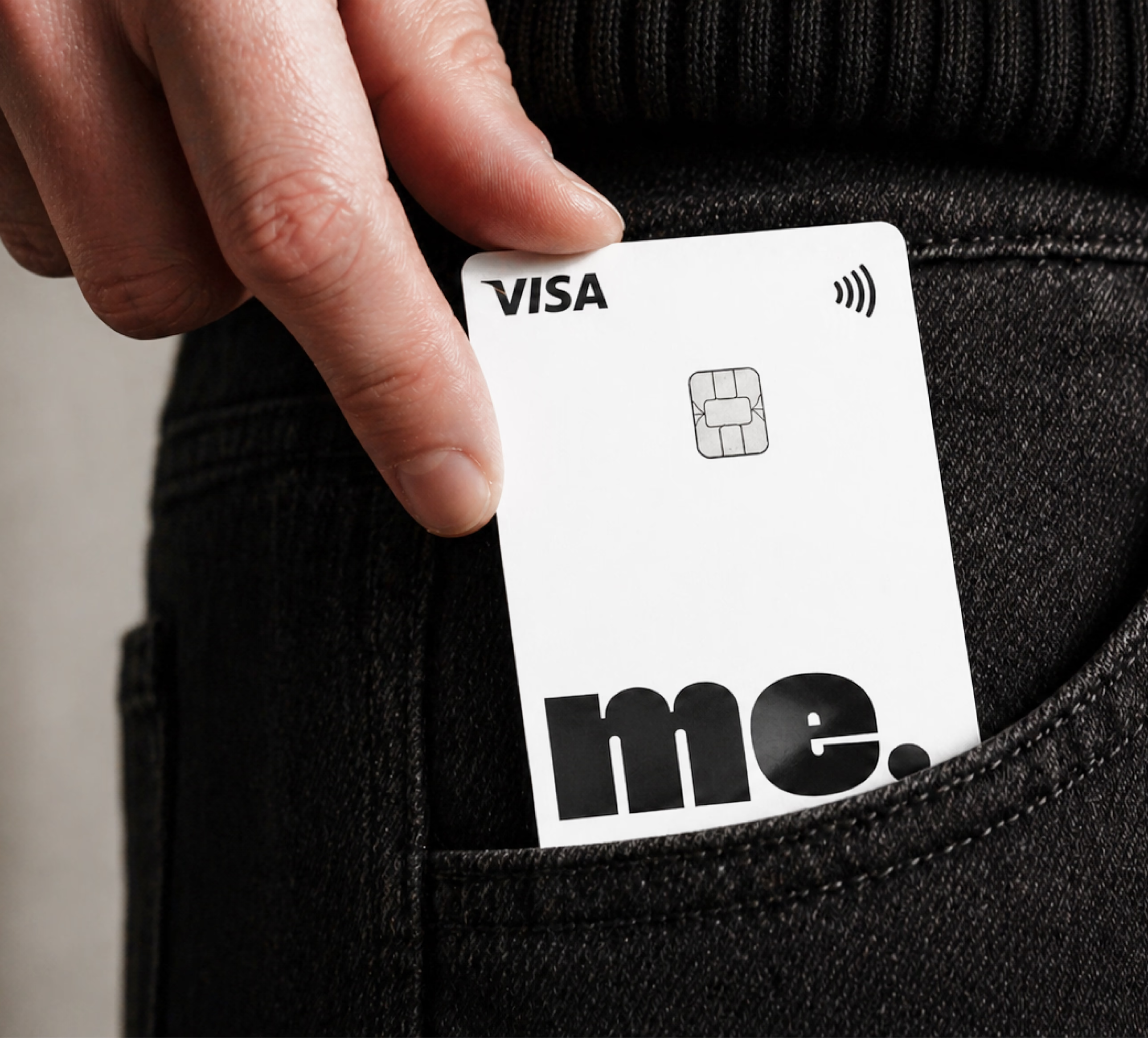
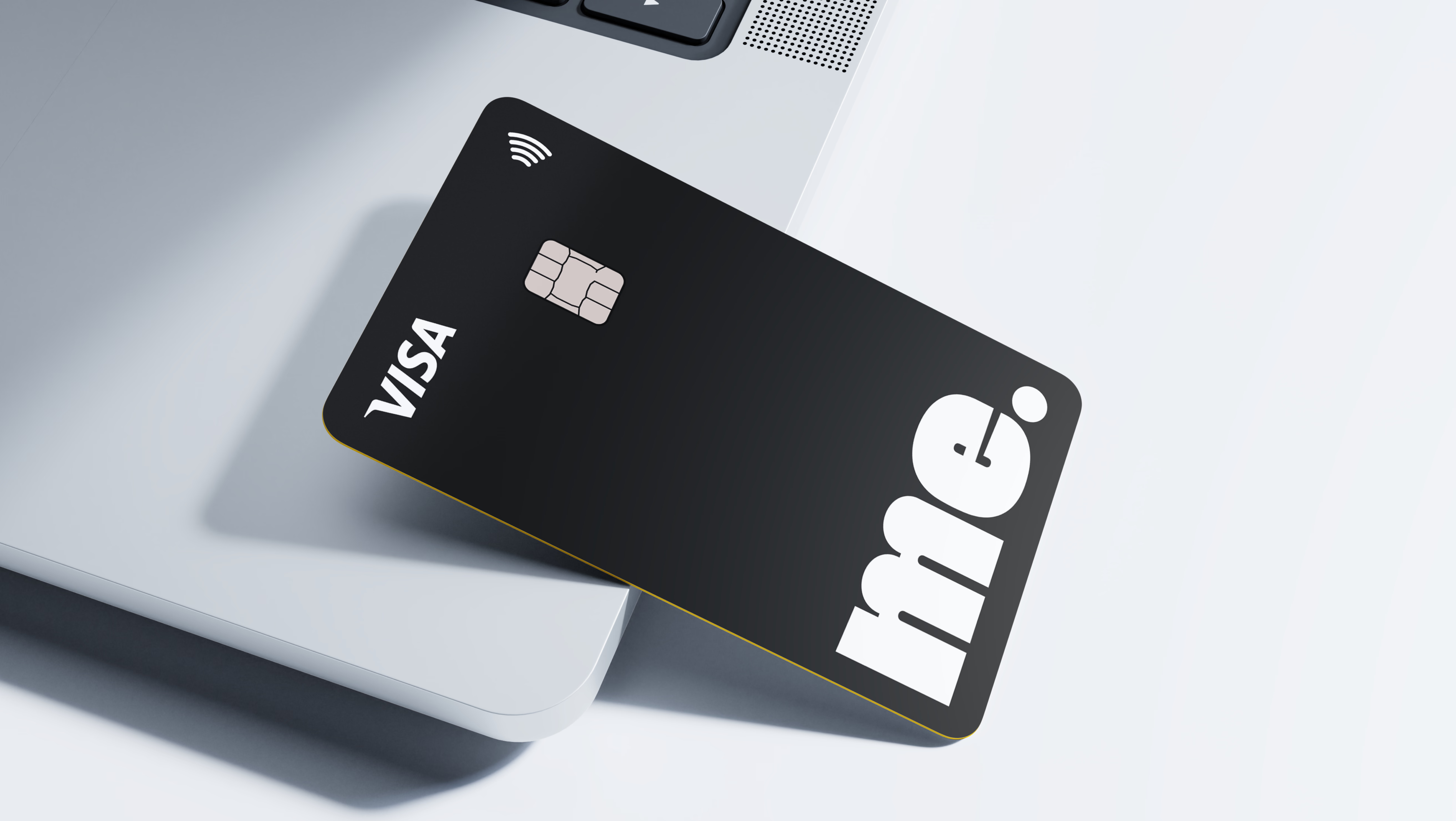
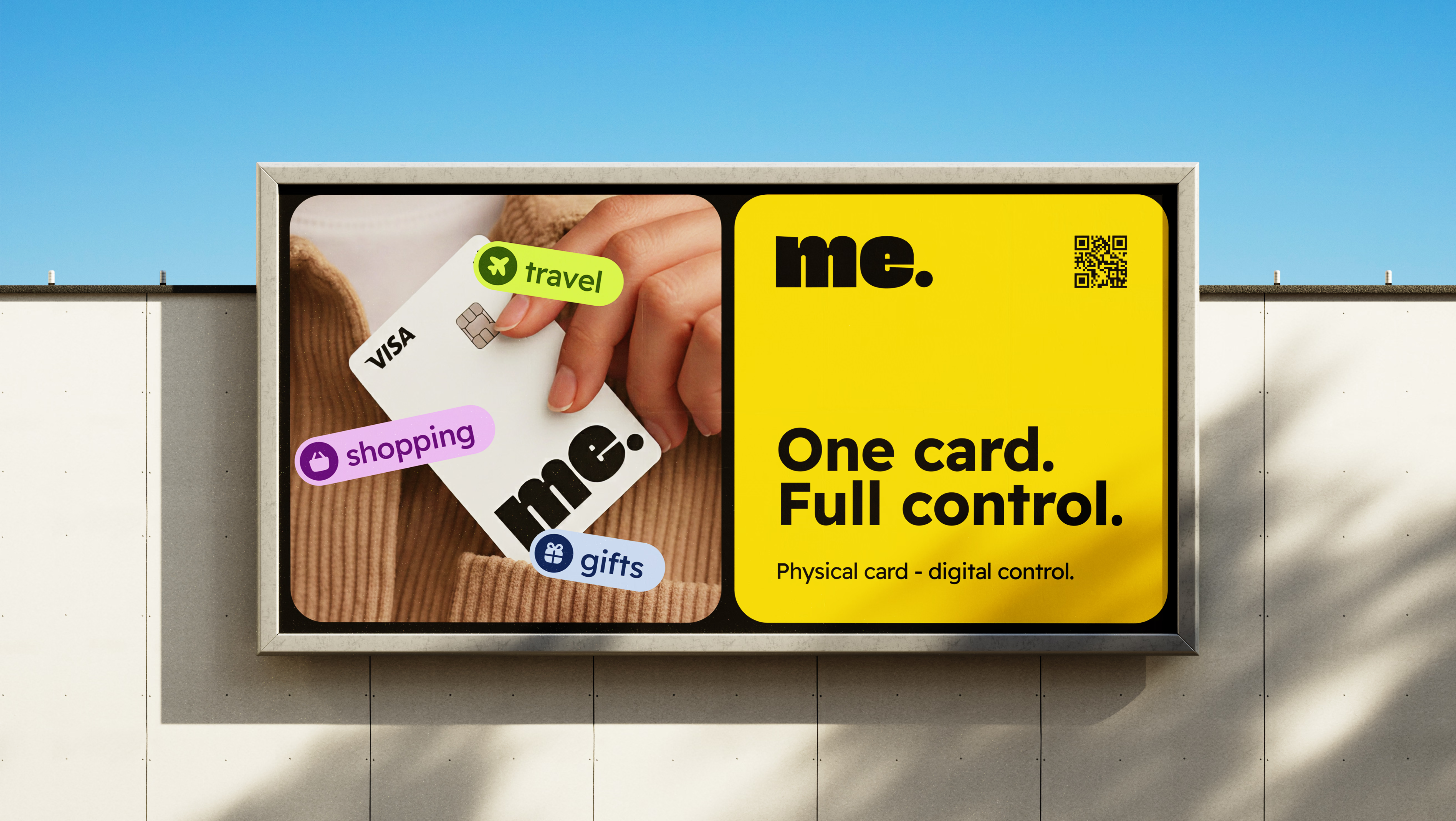
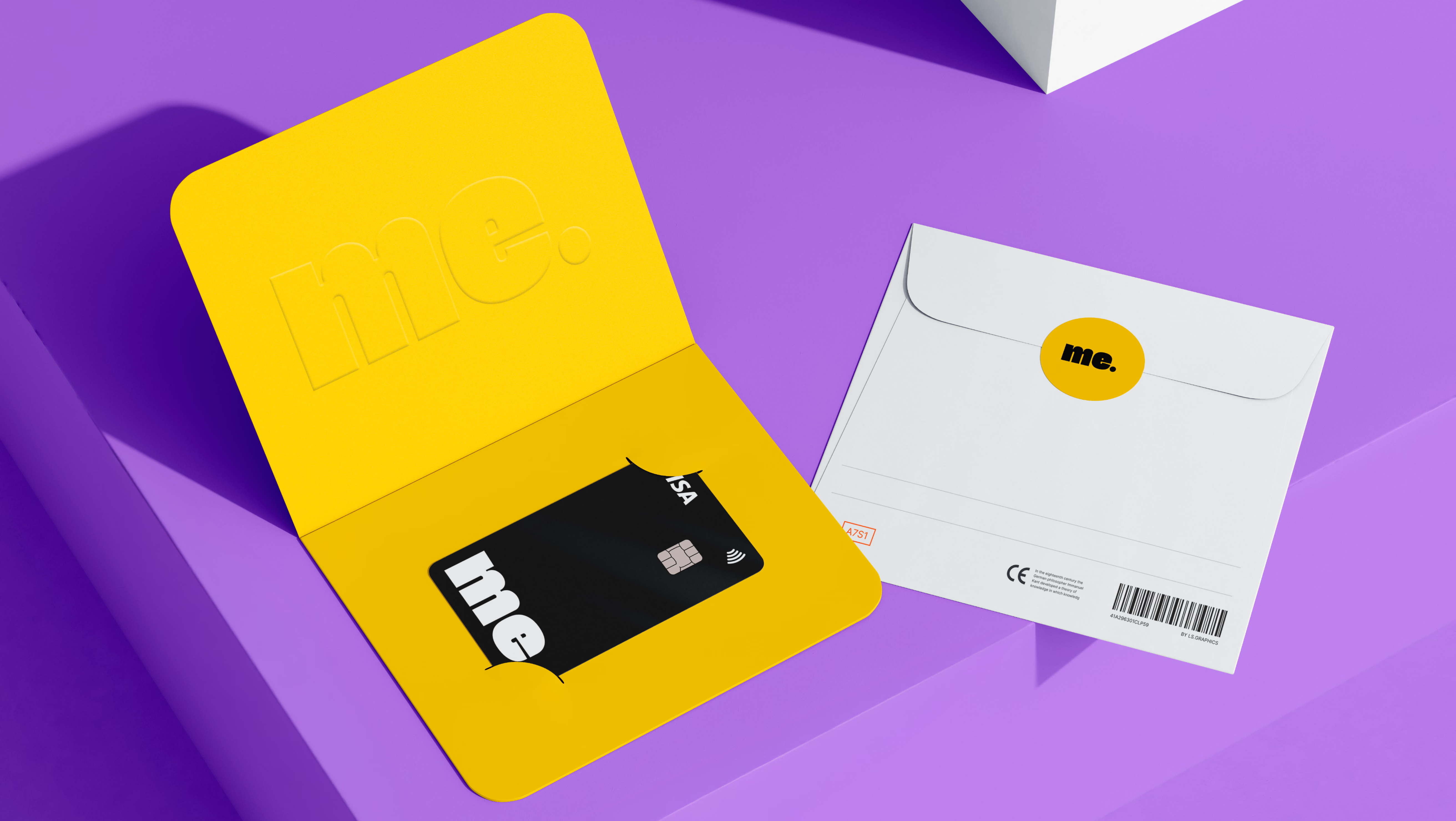
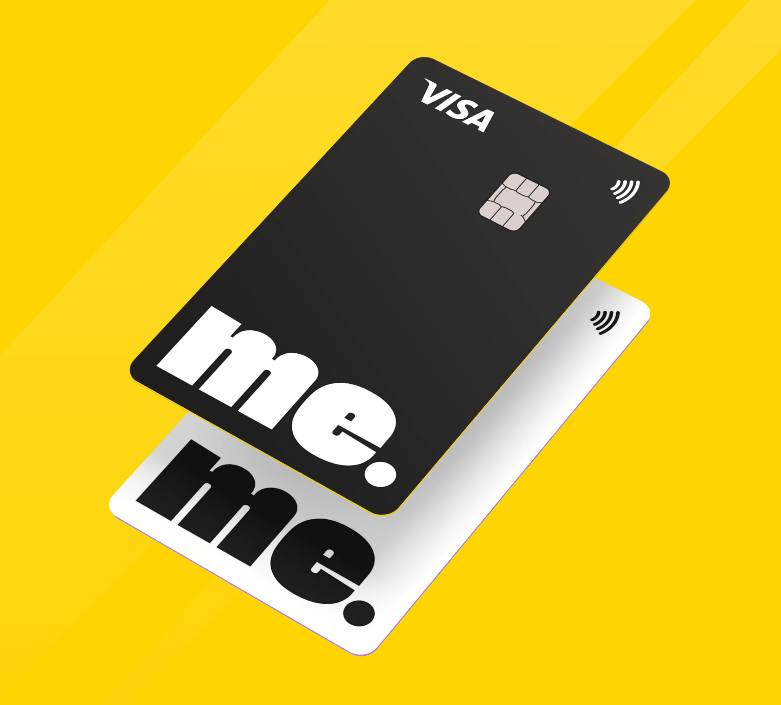
The card designs extend the shared brand across both products: a restrained black-and-white version for adults and a brighter mascot-led version for children. This keeps the system cohesive while giving each audience a distinct expression.

Merch

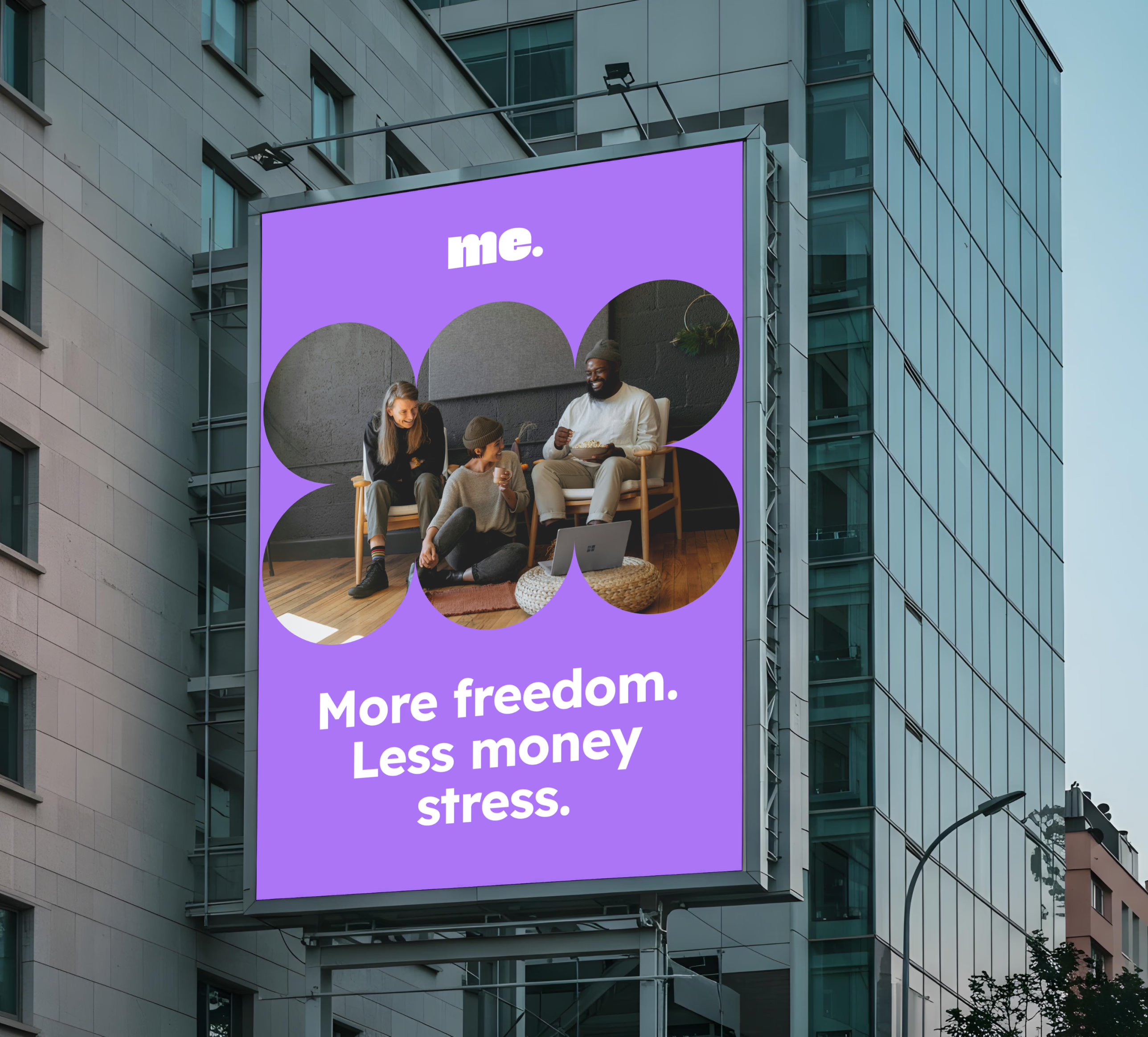
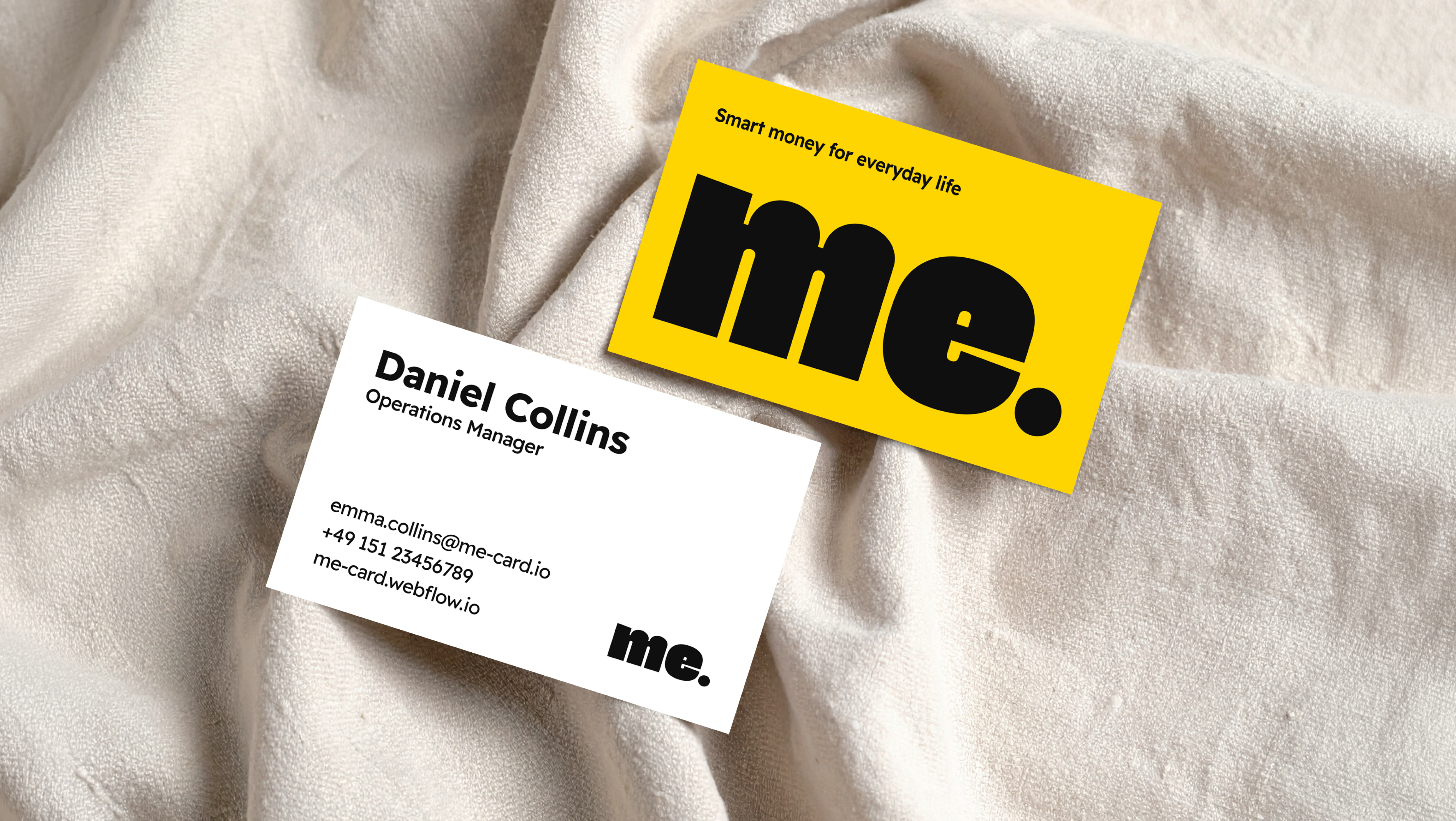
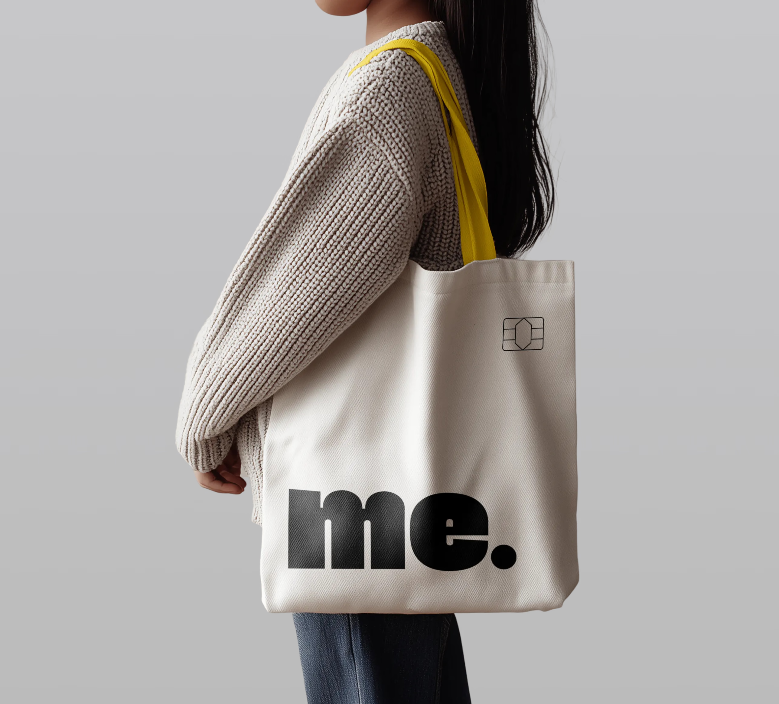
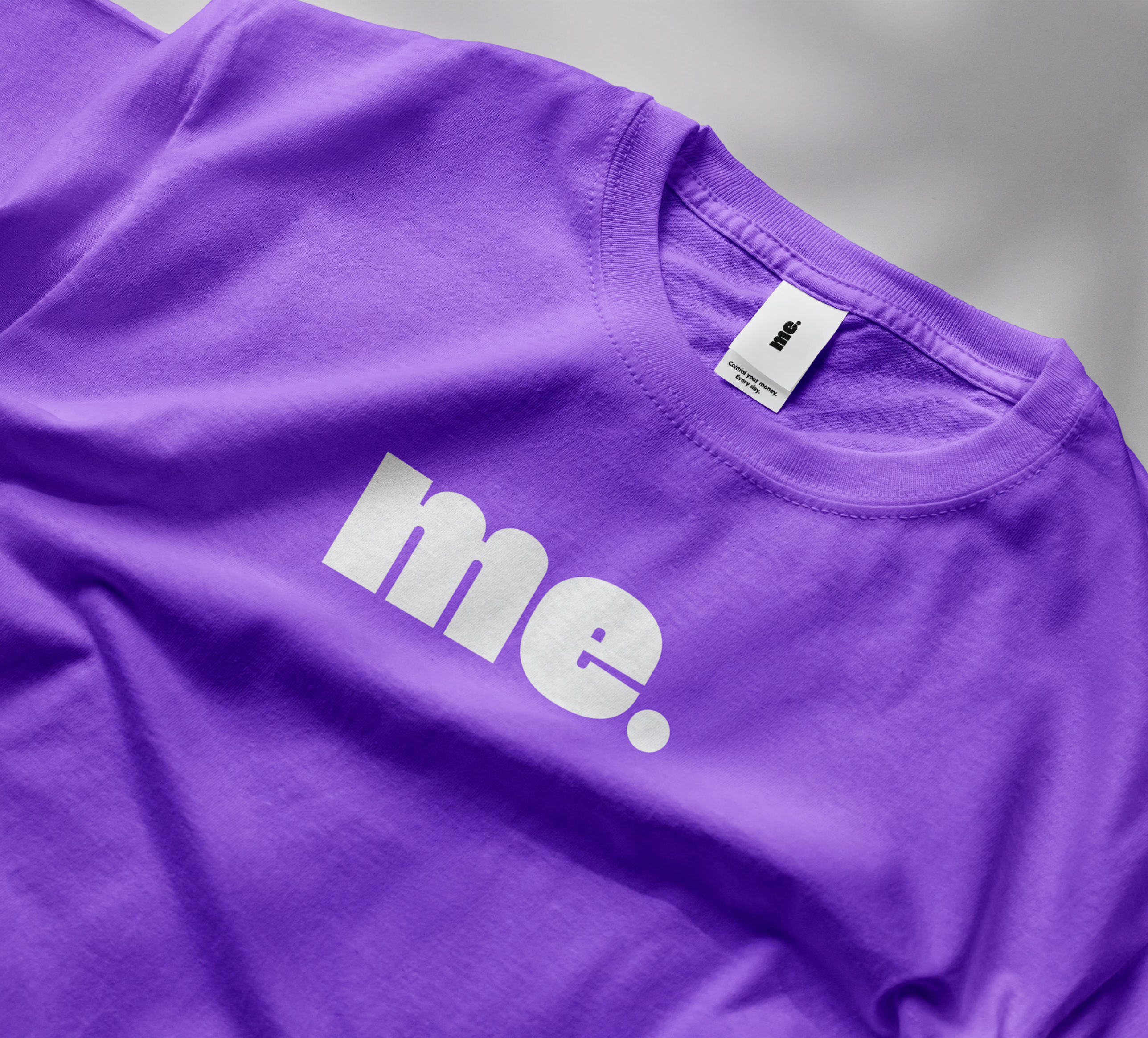
The identity extends consistently across advertising, stationery, packaging, merchandise, and digital touchpoints. Bold typography and the yellow-purple palette make the brand instantly recognizable while leaving room for both the adult and children’s visual styles.

Explore our other projects