

The right web app design agency for a workflow-heavy or data-dense product is one that has shipped complex interfaces before, researches the people who use the tool every day, designs from reusable components, and hands over work engineers can build without guessing. Visual polish matters, but it comes after speed, accuracy and fewer errors in daily work.
This guide covers the criteria to judge agencies on, the questions to ask before you sign, and what a component-first, engineering-aware process looks like in practice.
Reviewed by Oleksandr Perelotov, Co-Founder and Design Director at Excited. Disclosure: Excited is a web app design agency and describes its own process in this guide.
What is a workflow-heavy or data-dense web app?
A workflow-heavy web app is software where users complete long, multi-step tasks many times a day, often across several roles and approval stages. A data-dense web app is one that shows large volumes of records, filters, metrics and statuses on a single screen. Internal tools, CRMs, scheduling suites, quoting platforms and admin panels usually have both traits.
These products are judged differently from marketing sites or consumer apps. Users are experts. They open the tool every morning and live in it all day. A two-second delay or an extra click on a task they repeat 80 times a day costs real money. That is why the agency you pick needs a different skill set from one that designs landing pages.
Why do generalist design agencies struggle with complex web apps?
Generalist agencies struggle because they optimise for first impressions, while complex web apps are judged on the hundredth use. A beautiful dashboard that hides a frequent action behind a menu will fail in week two.
The common failure points are predictable:
- Screens designed one by one, with no shared components, so the product drifts as it grows.
- Only the happy path designed. Empty, loading, error and permission states are left to developers.
- Tables treated as decoration rather than the main work surface.
- Handoff files that look finished but cannot be built without weeks of follow-up questions.
- No research with the people who actually use the tool, only with the stakeholders who buy it.
{{{{service-card}}}}
What criteria should you use to evaluate a web app design agency?
Evaluate a web app design agency on six things: proven work on dense interfaces, research with real users, a component-first design system, engineering-aware handoff, a clear device strategy, and a method for balancing usability with visuals and business goals. Each one is explained below.
1. Has the agency shipped data-dense products before?
Ask to see live products, not concept shots. Look for tables with bulk actions, multi-step forms, role-based views and dashboards built for daily use. A portfolio full of hero sections and mobile mockups tells you little about how the team handles 40 columns of data. If you want a starting shortlist, we compared specialists in our guide to agencies for complex web app UX.
2. Do they research the people who use the tool every day?
The best agencies interview and observe end users, not only the product owner. For an internal tool, that means sitting with the operations team, watching how they work around the current system, and mapping each role's real workflow. Research should end in a prioritised list of problems, not a slide deck of personas.
3. Do they design from components, not screens?
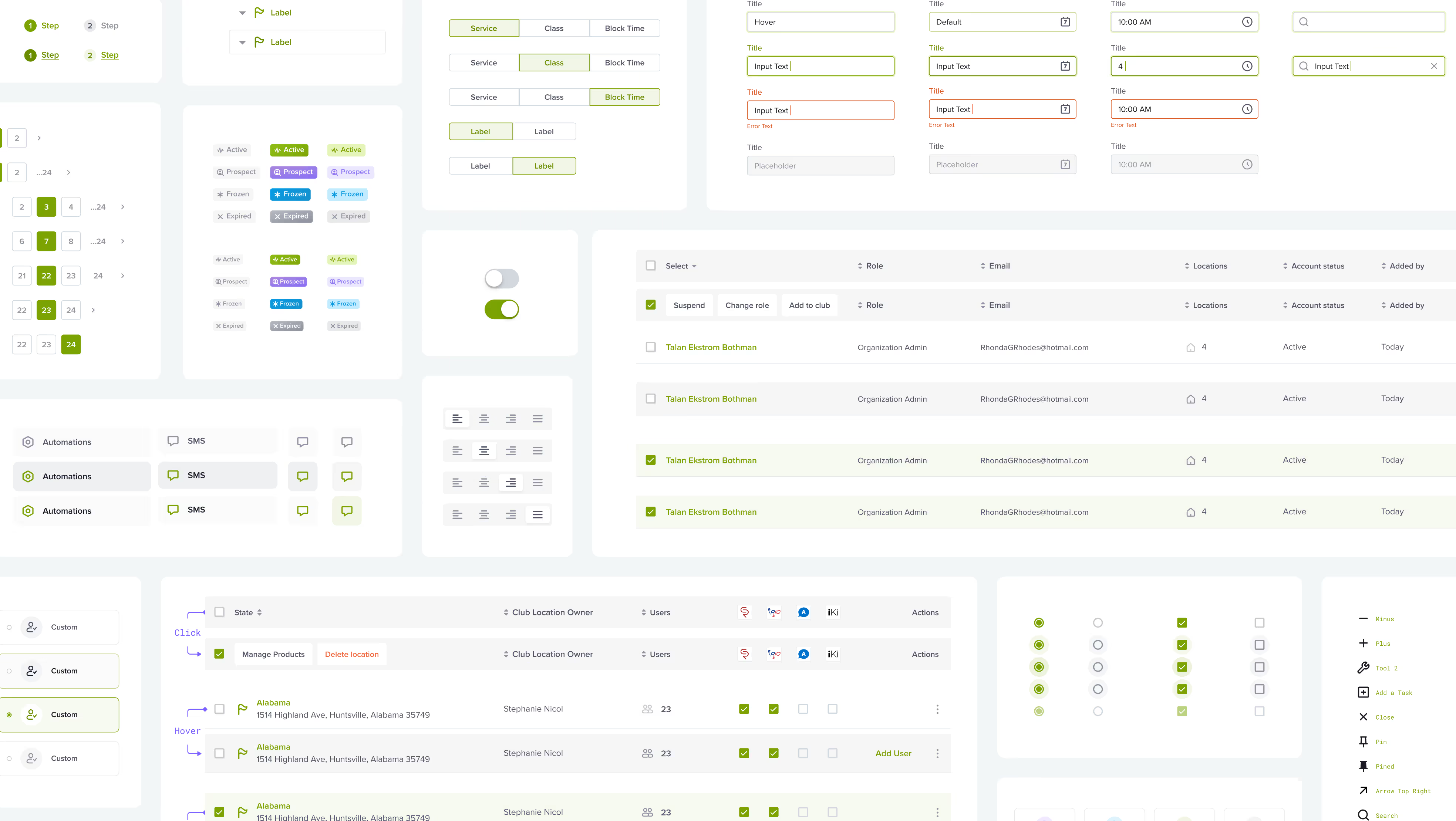
Component-first design means the agency builds a library of reusable parts, such as tables, filters, form fields and status badges, before designing full screens. This keeps hundreds of screens consistent and lets engineering build once and reuse everywhere. Ask how many components their last design system had and how it was documented.
4. Is their handoff engineering-aware?
Engineering-aware handoff means designs map onto how the product will actually be built. Components match the front-end framework, spacing follows a grid, every state is designed, and edge cases are annotated. Good agencies review the build and stay available while developers implement. Ask to see a real handoff file from a past project.
5. Do they have a desktop and tablet strategy?
Workflow-heavy tools are usually used on desktop, but some roles work on tablets at a front desk, in a warehouse or on site. The agency should ask where each role works before deciding layouts. More on this below.
6. Can they balance usability, visuals and business goals?
The agency should connect design decisions to business metrics such as task time, error rate, activation or support tickets. Visual quality still matters, because it builds trust and helps sales demos. But it should never come at the cost of speed in core tasks.
| Criterion | What good looks like | Red flag |
|---|---|---|
| Relevant portfolio | Live B2B products with tables, roles and long flows | Only landing pages and concept shots |
| User research | Interviews and observation with daily users of each role | Research limited to stakeholder workshops |
| Design system | Documented component library with states and tokens | Screens designed one at a time |
| Handoff | Annotated flows, edge cases, build review | Static files sent once, then silence |
| Device strategy | Layouts chosen per role and task | Desktop screens shrunk to fit a tablet |
| Business alignment | Success measured in task time, errors and adoption | Success measured only by stakeholder approval |
Which questions should you ask a web app design agency before signing?
Ask questions that force the agency to show evidence, not adjectives. These eight work well in a first call:
- Can you show a live product with a data table and bulk actions that you designed?
- Who did you interview on your last internal tool project, and what changed because of it?
- How many components did your last design system have, and how was it documented?
- How do you design empty, loading, error and permission states?
- What does your handoff include, and do you review the build?
- How do you decide what goes on desktop versus tablet?
- Which metrics did your last redesign improve, and by how much?
- Who from your team works on our project day to day, and how often do we review work?
Pay attention to how specific the answers are. An agency with real experience will name tools, numbers and trade-offs without being prompted.
How should an agency design a web app for desktop and tablet?
A good agency designs desktop-first for workflow-heavy products, then designs tablet views around the tasks people actually do away from a desk. Tablet is not a smaller desktop. It is a different context with touch input, shorter sessions and often one hand free.
In practice, that means:
- Desktop carries the full workspace: wide tables, side panels, keyboard shortcuts and multi-step forms.
- Tablet focuses on a narrower set of tasks, such as check-ins, approvals or quick lookups, with larger touch targets.
- Columns are prioritised per role, so the tablet table shows the three fields that matter instead of twenty.
- Both views share the same components, so the experience stays consistent and engineering builds once.
For example, a front-desk team at a fitness club checks members in on a tablet, while managers plan schedules and run reports on desktop. Each view should be designed for its job.
How do you balance usability, visuals and business goals in a complex web app?
You balance them by ranking them per screen. On core task screens, usability wins: speed, clarity and fewer errors. On first-run, demo and reporting screens, visual quality carries more weight because it builds trust with buyers and executives. Business goals decide which screens get attention first.
A simple rule we use: if a screen is opened more than 20 times a day by the same person, every design decision on it is judged by task time and error rate. If a screen is mainly seen in a sales demo or a monthly review, polish and storytelling earn more space. Both matter. They just matter in different places.
What does a component-first, engineering-aware design process look like?
A component-first, engineering-aware process starts with workflows and parts, not with pretty screens. This is the sequence we follow at Excited on complex web apps:
- Workflow discovery. Interview and observe each user role, map current workflows, and list the problems that cost the most time.
- Information architecture. Restructure navigation, objects and permissions around how people actually work.
- Component inventory. Define the reusable parts, such as tables, filters, forms and statuses, before full screens.
- Prototype core flows. Build clickable prototypes of the highest-frequency tasks first.
- Usability testing. Test with real users, moderated or unmoderated, and fix what slows them down.
- Handoff and build support. Deliver documented components and annotated flows, then review the build with engineers.

We wrote about this approach in more detail in how we design complex web app UX that engineers can actually build. The same principles apply to dashboards, which we cover in our guide to dashboard UX design.
By the numbers: on recent platform projects, Excited's design systems have run from 100 to 335 components.
- InsuredMine's insurtech CRM uses a 335-component system.
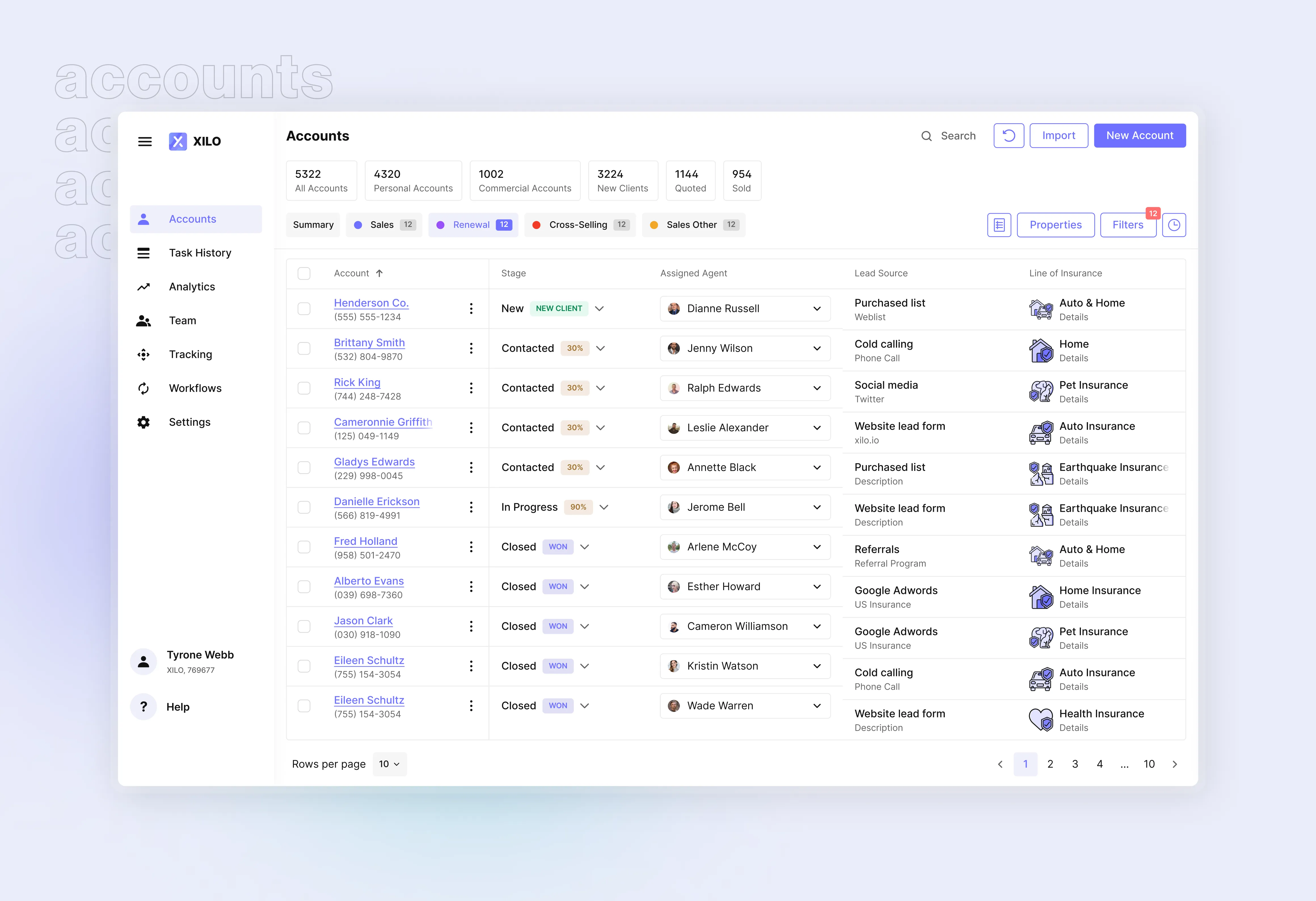
- Xilo's insurance quoting platform, a partnership running since 2020, uses 200+ components and serves 300+ corporate clients across 38 US states.

{{case-study}}
How do you make the final choice between shortlisted agencies?
Make the final choice with a paid discovery phase or a short design sprint on one real workflow. Two or three weeks of real work tells you more than any pitch. You will see how the team asks questions, how it handles your data and constraints, and whether engineers can build what it designs.
If you are still building a shortlist, our overview of UI design services compares agencies by focus, rate and team size. Or see how we approach web app design for workflow-heavy products.
Conclusion
The best web app design agency for a workflow-heavy or data-dense product is the one that can prove it has made complex work faster for real users. Judge agencies on relevant live work, research with daily users, component-first design systems and engineering-aware handoff, and test them on one real workflow before committing.
ClubReady, a leading fitness and wellness club management SaaS, partnered with our design team to redesign its scheduling, booking, marketing and user-management modules under one design system.
Service short description