

Dashboards, CRMs, analytics tools and internal platforms are not brochure sites — they are systems, and designing systems well requires a different approach than designing interfaces. The gap between a beautiful prototype and a shippable one is rarely the engineers, and rarely even the design.
This is the process we use to close it: starting from constraints instead of a blank canvas, designing in components rather than screens, speccing every state before handoff, working from real data, staying embedded with engineering, annotating behaviour as well as appearance, and agreeing a shared vocabulary early.

There is a version of this story that every product team knows. The designer ships a beautiful prototype. The engineers open it, go quiet for a moment, and then start asking questions. “What happens when there are 500 rows?” “What does this look like on a smaller screen?” “How does this state transition work?” The handoff becomes a negotiation, scope gets cut, and the thing that ships looks nothing like what was designed.
The problem is rarely the engineers. It is rarely even the design. It is the gap between how design is typically done and how software is actually built.
We have spent years closing that gap, specifically in the context of complex web applications: dashboards, CRMs, analytics tools, internal platforms, SaaS products with deep feature sets. These are not brochure sites. They are systems. And designing systems well requires a fundamentally different approach than designing interfaces.
Here is how we do it.
Start with constraints, not a blank canvas
Knowing your constraints before you draw a single screen is what separates design that ships from design that gets negotiated down. Most design processes begin with possibility; ours begins with limits.
Before a single screen is drawn, we sit down with the engineering team and ask the questions that will shape every decision downstream: What is the underlying data model? What are the performance constraints? What does the component library already include? Are there API limitations that affect real-time features? What is the browser or device support requirement?
These are not afterthoughts. They are the foundation of good UX for complex systems. A dashboard that cannot load 10,000 records in under two seconds is not a UX problem, it is an architecture problem. But if the designer never asked, they might spend three weeks designing an experience that assumes instant data retrieval.
Understanding constraints early does not kill creativity. It channels it. The best design decisions we have made came directly from understanding what we were working with.
{{{{service-card}}}}
Design in components, not screens
Designing in components rather than screens is the single practice that most directly closes the gap between design and engineering. Screens are a lie. They show one perfect state of one moment in a product that actually has hundreds of states and thousands of moments.
We build from components up. Before designing a dashboard, we design the card. Before designing the card, we design the data cell. Before the cell, we define the tokens: spacing, color, type scale, elevation. Every piece connects to every other piece through a shared system.
This matters for engineers because they build the same way. React, Vue, and Angular are all component-based frameworks. When a designer delivers a Figma file organized around screens, the engineer has to mentally decompose it back into components before they can write a single line of code. When we deliver a file organized around components, the mapping is nearly one-to-one.
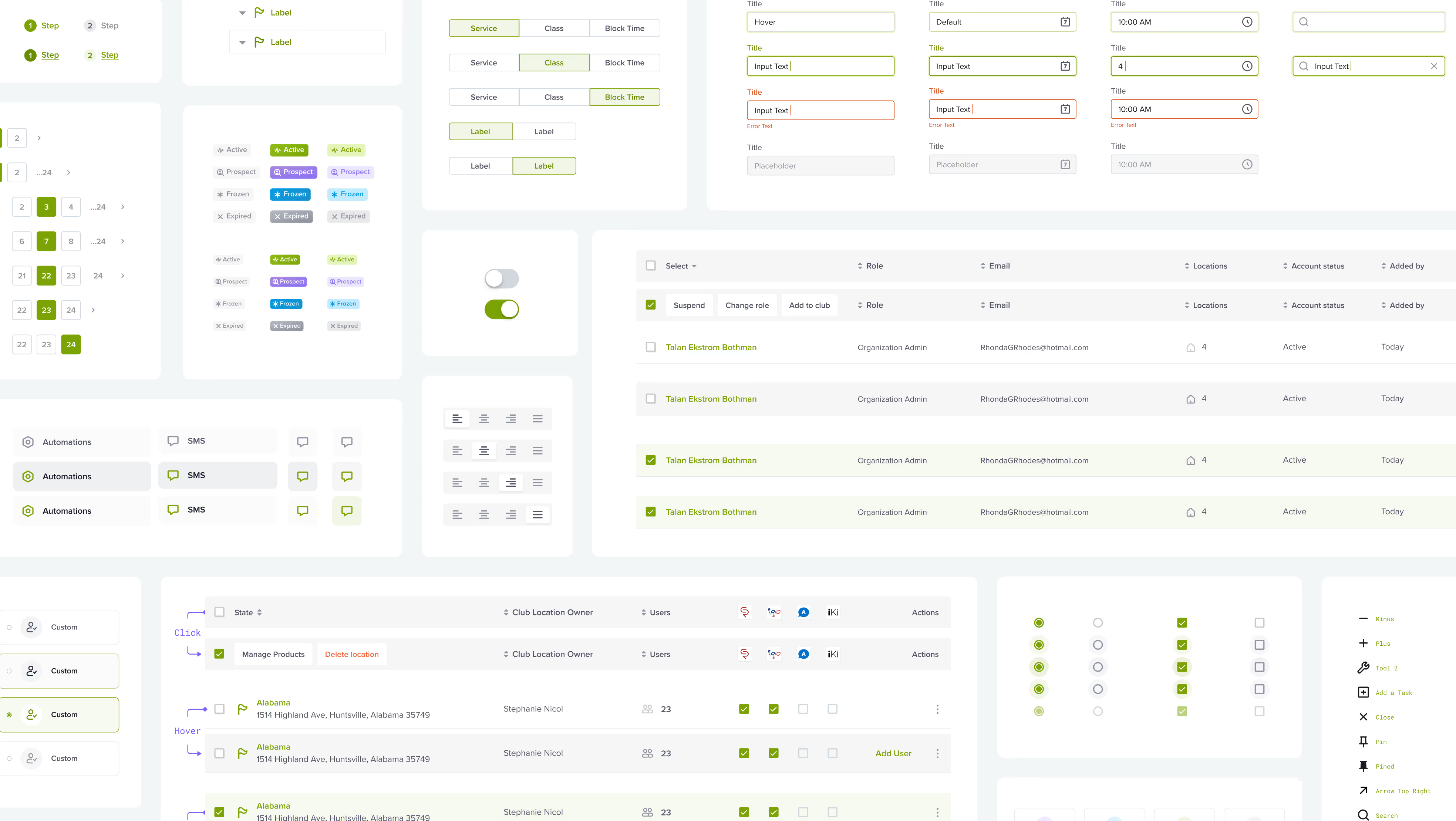
The side benefit is consistency. When every table in the application uses the same table component, designed to handle sorting, filtering, empty states, and pagination from day one, the product holds together at scale in a way that screen-by-screen design never can.
Design every state, not just the happy path
Every meaningful state a component can reach must be designed before handoff, not invented by engineers mid-sprint. The hardest part of complex web app design is not the happy path. It is everything else.
A complex data table has at least a dozen distinct states: loading, empty, partial data, error, filtered with no results, sorted, paginated, with a selected row, with a hovered row, with an inline edit active. Most designers show one of these. Engineers have to invent the rest, which means inconsistent UX, edge cases that never get caught, and a product that feels rough in production even though it looked polished in Figma.
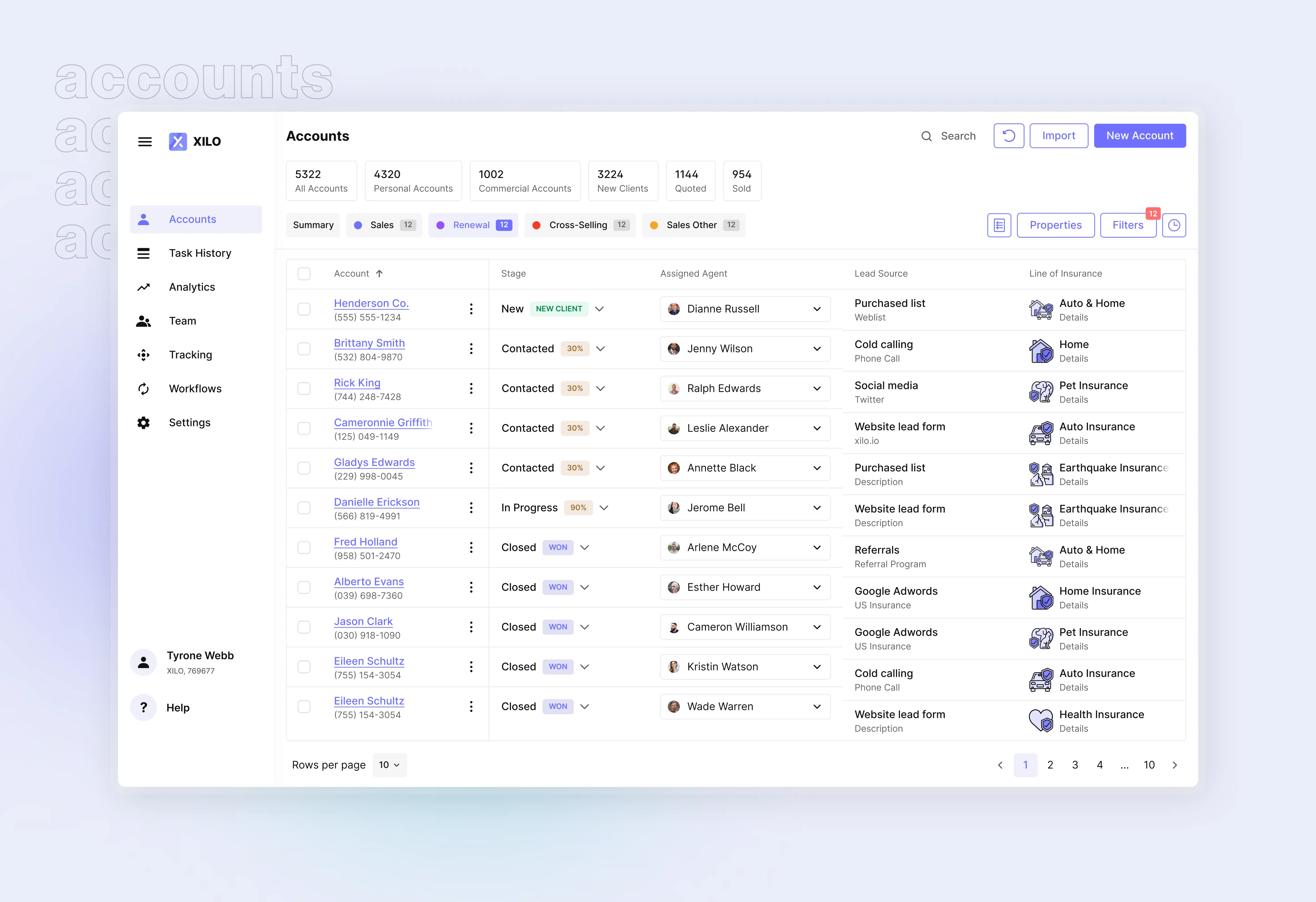
We design every meaningful state before handoff. This includes:
- Loading states. Skeleton screens, spinners, or progressive reveals, specified per component, not applied as an afterthought.
- Empty states. What does the user see when there is no data? What action should they take? An empty state is a product moment, not a blank rectangle.
- Error states. Network failures, permission errors, validation failures. Each one needs a designed response.
- Overflow and edge cases. What happens when a username is 80 characters long? When a table has one row versus 10,000? When a chart has a single data point?
Doing this work in design is significantly cheaper than doing it in engineering. A designer can spec an empty state in 20 minutes. An engineer who has to invent one mid-sprint will spend twice that and probably get it wrong because they do not have the product context the designer does.
Use real data from the start
Designs built on placeholder data lie about the product they represent. Placeholder text and dummy data are the enemy of honest design.
When you design a user profile with the name “John Smith” and an avatar that fits perfectly, you have not designed a user profile. You have designed a best-case scenario. The actual product will have users named “Bartholomew-Harrington, Jr.” and profile photos that are blurry screenshots.
We source real or realistic data as early as possible in the design process. For existing products, we pull actual anonymized production data. For new products, we generate realistic synthetic data that reflects edge cases: long strings, missing fields, unusual values, mixed languages. We then stress-test our designs against that data before a single line of code is written.
The result is designs that account for reality. Tables that do not break with long cell content. Forms that validate in ways that match real user input. Charts that handle sparse data, outliers, and date gaps. Engineers notice immediately when they receive designs built on real data. It signals that the designer has thought past aesthetics and into the actual product.
Work in tight loops, not long handoffs
Continuous, low-friction collaboration between design and engineering produces better outcomes than any handoff process, no matter how polished the deliverable. The traditional design process hands off to engineering and then waits. Questions come back, changes get made, another handoff happens. In complex systems, this cycle is too slow and too lossy.
We embed with engineering throughout the build. During development, we run weekly design reviews where we look at the actual product in the browser, not in staging screenshots, not in video recordings. We identify drift between the spec and the build, and we make decisions in real time about what to fix and what to accept as a technical tradeoff.

This requires designers who are comfortable reading a browser and engineers who are comfortable giving design feedback. It requires a shared vocabulary around components, states, and interaction patterns. It requires trust in both directions.
The projects that go well are not the ones where design hands off a perfect file and disappears. They are the ones where design and engineering are in constant, low-friction conversation from discovery through launch.
Annotate for behavior, not just appearance
A design file that specifies only appearance leaves engineers to invent behavior, and those invented decisions will not always match the intended experience. A Figma file tells an engineer what something looks like. It rarely tells them how it works.
Every interaction in a complex web application has behavior: what triggers it, what it affects, how long it takes, what happens if it fails. These are engineering decisions with significant UX implications, and if designers do not spec them, engineers will make judgment calls that may not align with the intended experience.
We annotate for behavior as a standard part of every handoff. This includes:
- Transition timing and easing for animations
- Keyboard navigation paths and focus management
- Scroll behavior in nested containers
- What API call a user action triggers and when
- Optimistic updates versus confirmed updates
- How errors surface and dismiss
These annotations do not need to be exhaustive documentation. They need to answer the questions an engineer will have before the engineer has to ask them. That shift alone reduces handoff friction by more than any design tool feature ever has.
Build a shared vocabulary early
A shared naming system across design, engineering, and product is the connective tissue that keeps a complex application team coherent. In complex web apps, naming matters. What the designer calls a “panel,” the engineer might call a “drawer” and the product manager might call a “sidebar.” When three people use three different words for the same thing, communication slows down and misalignments compound over time.
We establish a shared component vocabulary at the start of every engagement. We align on what to call things: the names in Figma match the names in code, which match the names in product discussions. This sounds like a small thing. It is not. In a large application with dozens of components and hundreds of interactions, a shared naming system is the connective tissue that keeps the team coherent.
What this looks like in practice
In a recent engagement, we were brought in to redesign the core workflow of a B2B SaaS platform used by operations teams managing complex multi-step processes. The existing product had accumulated years of technical debt, inconsistent patterns, and a design system that existed in name only.
We spent the first two weeks doing no design at all. We mapped the data model with the engineering team. We audited the existing component inventory. We documented every state in the current product, including the ones nobody had intentionally designed. We ran sessions with users to understand where the existing UX created friction and why.
When we started designing, we designed components first: a new table component that handled all the data-density requirements, a form system that supported conditional logic, a notification framework that worked across async operations. We built these in Figma with full state coverage and real data.
By the time we got to screen-level design, engineering had already reviewed the components and flagged two technical concerns that would have caused significant rework if we had caught them during development instead of design. The handoff took half the time of a typical engagement. The build came in under estimate.
That is what good process looks like for complex systems.
{{case-study}}
The honest truth about this work
Designing complex web app UX well is slow at the front end and fast at the back end. It requires more research, more engineering collaboration, more component design, and more state documentation than most timelines budget for.
The payoff is a product that engineers can actually build, that holds up at scale, and that does not require constant design intervention to maintain coherence as it grows.
The alternative is faster in week one and painful for the next two years.
We will take the slower start every time.
Excited is a product design agency that specializes in complex web applications for SaaS, fintech, and enterprise software teams. If you are weighing up UI UX design services for a system like this, our breakdown of the leading agencies is a useful place to start. If you are building something with real design and engineering complexity, we should talk.
ClubReady, a leading fitness SaaS provider, partnered with our design team on a component-driven redesign of a dense operations product.
Service short description