
Getting a user to checkout means most of the work is already done. With average cart abandonment at around 70%, these ten checkout UX best practices help remove the obstacles between purchase intent and conversion.

Getting a user to checkout means most of the work is already done: they've found the product, accepted the price, and shown intent to buy. Now, the checkout's job is simple: don't break that momentum.
Yet this is often where friction appears: account creation, long forms, delivery choices, unexpected fees, or payment issues. With average cart abandonment at around 70%, according to Baymard Institute, there's plenty of room to improve.
Checkout optimization is ultimately about removing obstacles between purchase intent and conversion.
Why Do Customers Abandon Checkout?
Cart abandonment isn't just a UX metric. It directly affects revenue, paid acquisition ROI, remarketing costs, and customer lifetime value.
Imagine 10,000 customers add something to their cart. If 70% leave, only around 3,000 complete the purchase. Even a relatively small improvement in checkout completion can therefore create meaningful additional revenue without increasing traffic.
Some abandonment is unavoidable. But common UX-related reasons include:
- unexpected shipping, taxes, or fees;
- forced account creation;
- long or complicated forms;
- unclear delivery information;
- lack of trust around payment;
- missing payment methods;
- technical errors;
- poor mobile experience.
Most of these problems come down to two things: too much effort or too much uncertainty. Good checkout UX reduces both, and an ecommerce UX audit is the fastest way to find out which one is costing you orders.
{{{{service-card}}}}
1. Make Checkout Feel Short
Fewer screens don't always mean an easier checkout. A single page packed with forms, delivery options, payment methods, and order details can feel more overwhelming than a few focused steps.
For more complex checkouts, break the process into clear stages:
Shipping → Delivery → Payment → Review
For simpler purchases, a one-page checkout may work just as well.
Whichever approach you choose:
- remove unnecessary fields;
- group related information;
- keep each step focused;
- show progress;
- let users go back without losing information;
- preserve entered data.
The goal isn't fewer screens. It's a checkout that feels easier to complete.
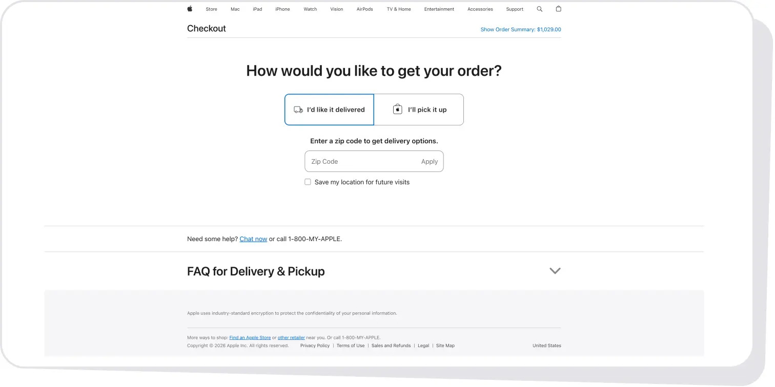
2. Don't Force Users to Create an Account
A customer who reaches checkout wants to buy something, not necessarily start a relationship with the brand.
Forced registration adds another task at exactly the wrong moment. Baymard reports that 24% of users have abandoned checkout because they were required to create an account.
A better flow is:
Guest Checkout → Purchase → Optional Account Creation
Once the purchase is complete, users have already provided most of the information needed to create an account, making registration a useful next step rather than a barrier. Guest checkout should also be easy to find and given similar visual priority to Sign in, not hidden as a secondary option.
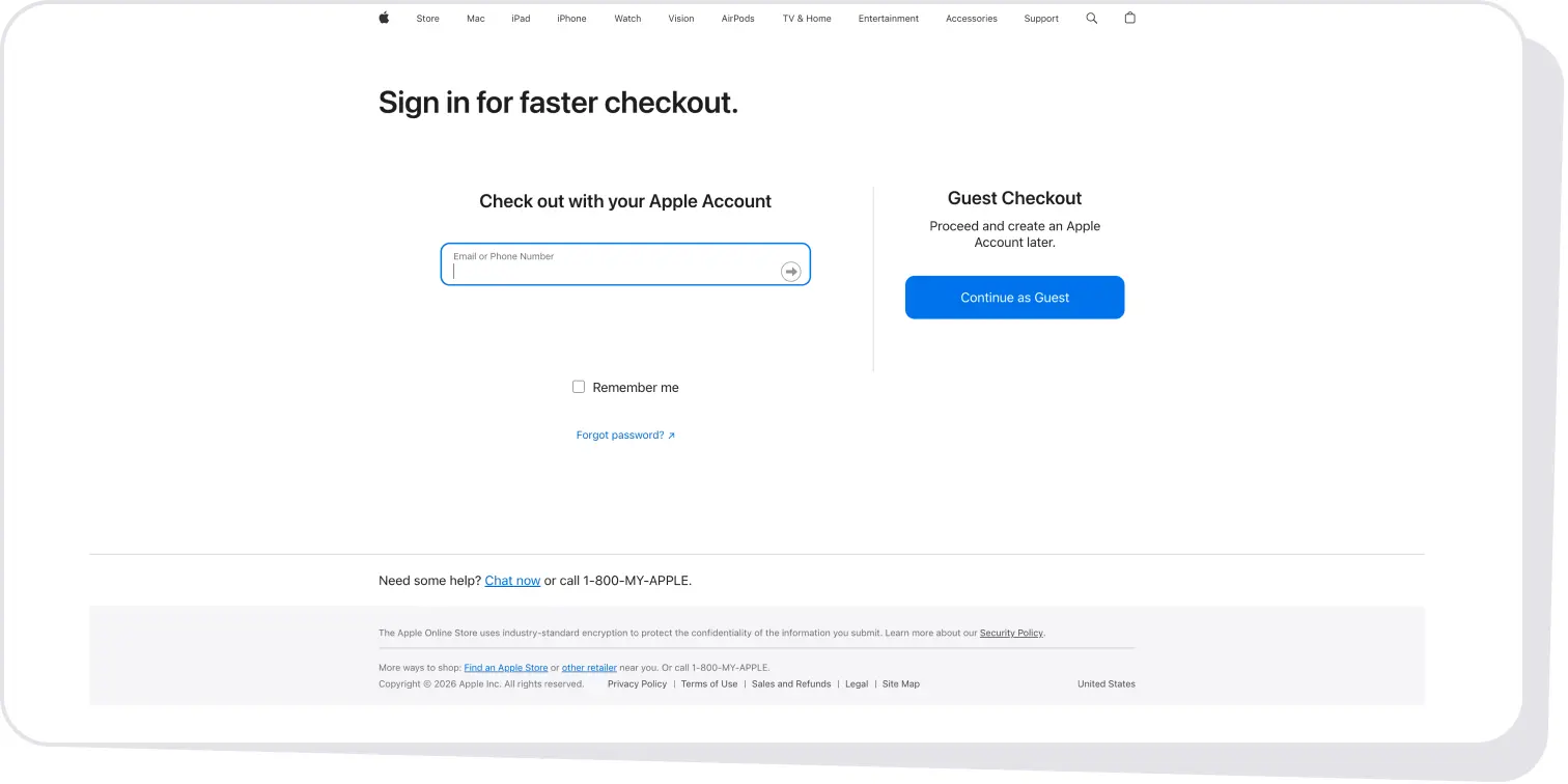
3. Make Costs Predictable
Few things create checkout hesitation faster than watching the price unexpectedly increase.
A product may cost $80 in the cart but become $105 after shipping, taxes, or service fees. Even when those charges are legitimate, revealing them late forces the customer to reconsider a decision they thought they'd already made.
Show costs as early as possible:
- subtotal;
- discounts;
- shipping;
- taxes and fees;
- final total.
If a cost can't be calculated yet, explain why and keep the order total visible or easily accessible throughout checkout.
4. Ask Users to Type Less
Every form field adds effort and another chance for error, so only ask for information that's essential to completing the purchase and let the interface handle as much of the rest as possible:
- browser autofill;
- address autocomplete;
- smart defaults;
- billing = shipping by default;
- automatic card and phone formatting;
- appropriate mobile keyboards;
- inline validation.
Clear, actionable error messages reduce friction by showing users exactly how to fix an issue, turning vague feedback like “Invalid input” into guidance like “Enter a 5-digit ZIP code.”
5. Make the Next Action Obvious
At every stage, users should know exactly what happens next.
Avoid repeatedly using a vague Continue CTA when the action can be more specific:
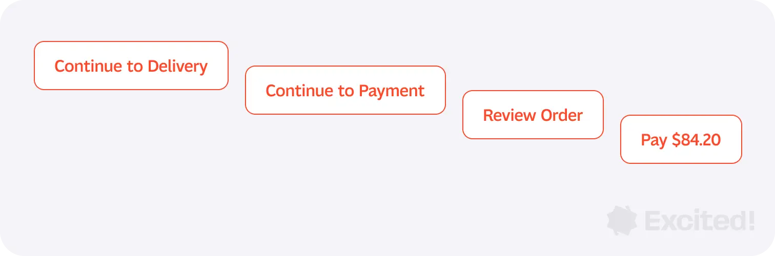
The final CTA is particularly important because it represents a financial commitment. Users shouldn't have to guess whether clicking it moves them forward or actually charges them.
A few principles should guide the entire checkout:
- Clarity: users understand what's happening.
- Transparency: costs, delivery, and conditions are visible.
- Control: information can be edited easily.
- Trust: payment feels legitimate and safe.
- Speed: unnecessary typing and decisions are removed.
- Forgiveness: mistakes are easy to correct.
- Continuity: progress isn't lost when users go back or encounter an error.
6. Design Mobile Checkout as a Primary Experience
Mobile amplifies almost every checkout problem.
Typing is harder, less information fits on screen, keyboards cover content, and users may need to switch apps to access payment information.
A strong mobile checkout should therefore prioritize:
- large touch targets;
- short forms;
- appropriate keyboards;
- Apple Pay / Google Pay;
- clear primary CTAs;
- collapsible order summaries;
- persistent totals;
- readable labels;
- predictable layouts.
Avoid multi-column forms, tiny checkboxes, hidden error messages, intrusive popups, and unexpected layout shifts.
{{case-study}}
7. Make Payment Almost Boring
Payment is where perceived risk is highest.
The interface should become calmer, not more complicated.
At this point, customers should immediately understand:
- what they're paying;
- how they're paying;
- when the order will arrive;
- what happens if something goes wrong.
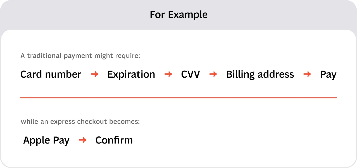
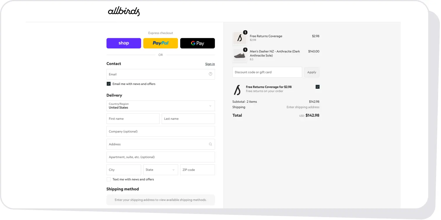
The right payment methods depend on geography, device, audience, and order value. Depending on the market, that may include cards, Apple Pay, Google Pay, PayPal, local payment methods, or BNPL options such as Klarna.
On mobile in particular, wallets can remove significant amounts of manual input.
Build Trust Through Clarity
Trust isn't created by surrounding a credit-card field with five security badges.
Useful trust signals answer questions customers already have:
- Payment: Is this secure?
- Order summary: Is this the final amount?
- Delivery: When will it arrive?
- Returns: What if I change my mind?
- Support: What happens if something goes wrong?
Place reassurance close to the decision it supports.
8. Design for First-Time and Returning Customers Differently
First-time and returning customers have different needs. New customers need more clarity and reassurance, while returning customers usually want to complete their purchase as quickly as possible.
For first-time customers, prioritize:
- guest checkout;
- clear delivery and return information;
- trust signals;
- minimal required information.
For returning customers, prioritize:
- saved addresses and payment methods;
- remembered preferences;
- express checkout;
- easy editing of saved details.
Localization also goes beyond language and currency. Checkout should reflect how customers in each market actually shop, from address formats and delivery expectations to preferred payment methods and financing options.
Personalize defaults, not control.
9. Don't Forget the Failure Experience
Cards get declined. Addresses are incomplete. Promo codes expire. Payment providers fail.
These situations are part of checkout UX too.
Good error handling should:
- preserve entered information;
- identify the exact problem;
- explain how to fix it;
- show the error near the relevant field;
- allow users to retry;
- suggest another payment method when appropriate.
A failed payment is frustrating. Making someone enter their address again turns frustration into abandonment.
10. Measure Before You Redesign
Checkout optimization should be ongoing, and it should start with evidence rather than assumptions. That's why our UX audit services begin with funnel data before anyone opens a design file.
Track:
- cart abandonment;
- checkout abandonment;
- completion rate;
- drop-off by step;
- form error rate;
- payment failure rate;
- mobile vs. desktop conversion;
- time to complete checkout;
- guest vs. logged-in conversion.
Analytics tell you where users struggle. Session recordings, usability tests, heatmaps, and support tickets help explain why.
Also look beyond overall conversion. Different customer segments, devices, markets, and payment methods may behave very differently, so checkout decisions should be based on actual customer behavior rather than a single industry benchmark.
Then use a simple optimization loop:
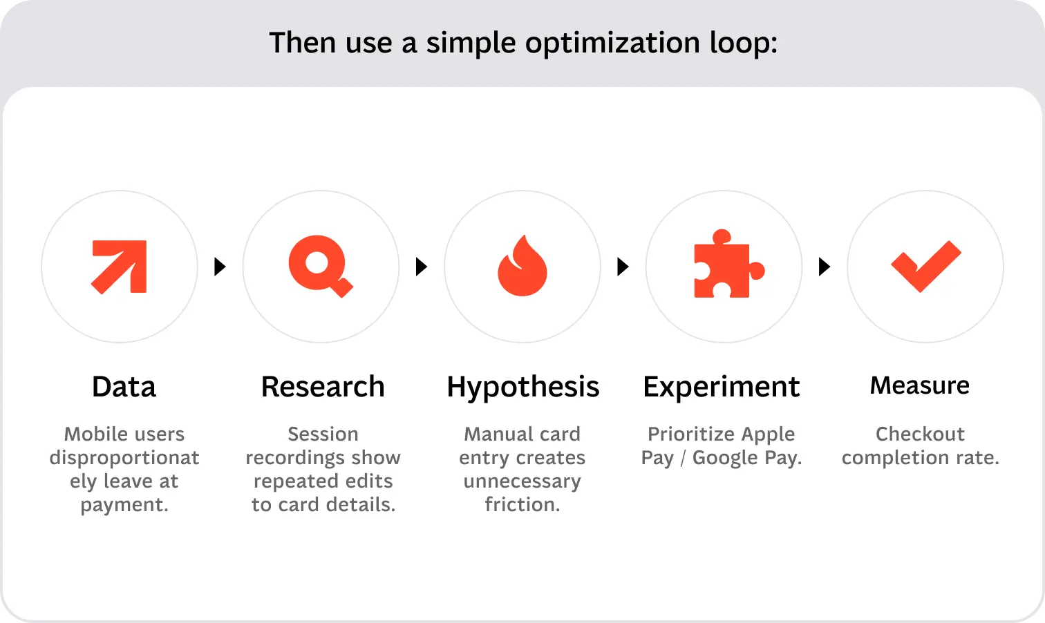
A/B testing can then validate individual changes such as guest-checkout placement, CTA wording, shipping-cost visibility, field reduction, payment-method order, address autocomplete, or trust messaging.
Avoid redesigning everything at once.
Find friction → Understand why → Test a solution → Measure the result.
The Best Checkout Is the One Users Barely Notice
There's no universal checkout flow: buying a T-shirt and booking a vacation require different levels of information. But the best experiences follow the same principle: keep the path to purchase clear and remove unnecessary decisions. If your checkout needs more than a few fixes, our ecommerce web design team can help rebuild the flow around how your customers actually buy.
Discover how we designed Doobi, a personalized laundry service app.
Service short description