

An ecommerce UX audit is a structured review of your store's user experience that identifies the specific friction points costing you orders. Done properly, it tells you exactly where your funnel leaks and what to repair first.

An ecommerce UX audit is a structured review of your store's user experience that identifies the specific friction points costing you orders. It combines analytics, expert review against usability best practice, and user behaviour data into one prioritised list of fixes. Done properly, it tells you exactly where your funnel leaks and what to repair first.
Most stores do not have a traffic problem. They have a conversion problem that nobody has diagnosed. Paid acquisition gets more expensive every year, so squeezing more revenue out of existing visitors is usually cheaper than buying new ones. A UX audit is how you find that revenue.
What Is an Ecommerce UX Audit?
An ecommerce UX audit is an expert evaluation of every step a shopper takes, from landing page to post-purchase, measured against usability principles and real behavioural data. The output is an audit report: a scored list of issues, each tied to a page, a severity level, and an estimated impact on conversion.
It is diagnostic work, not design work. The audit does not redesign your store. It tells you what is broken, how badly, and in what order to fix it.
A good audit answers three questions. Where do users drop off? Why do they drop off there? Which fix returns the most revenue per hour of development?
UX Audit vs CRO Audit vs Usability Testing
These three get used interchangeably and they are not the same thing. Buying the wrong one is a common and expensive mistake.
| UX audit | CRO audit | Usability testing | |
|---|---|---|---|
| Core question | Is the experience usable and coherent? | Where is revenue leaking and what should we test? | Can real people complete the task? |
| Method | Heuristic evaluation plus analytics review | Funnel and metric analysis, test roadmap | Moderated or unmoderated sessions with users |
| Output | Prioritised list of usability issues | Hypotheses ranked by expected lift | Observed failures and verbatim quotes |
| Typical duration | 1 to 3 weeks | 1 to 2 weeks | 1 to 2 weeks |
| Best when | The store feels clunky and you need a full picture | You have traffic and want a testing pipeline | You have a specific flow you suspect is broken |
In practice the strongest engagements combine them. The UX audit finds the issues, usability testing validates the serious ones, and a CRO programme measures the fixes.
{{{{service-card}}}}
When Should You Run a UX Audit?
Run one when something has changed or something has stalled. The clearest triggers are these.
- Conversion rate is falling while traffic holds steady or grows.
- You are about to redesign. Auditing first stops you from rebuilding the same mistakes in a new visual style.
- You are replatforming. Migrations quietly break flows that used to work.
- Traffic is up but revenue is flat. That gap is almost always a UX problem, not a marketing one.
- Peak season is coming. Fixing checkout friction in September is worth far more than fixing it in December.
- Nobody has looked in over a year. Stores accumulate small compromises. They add up.
If none of these apply and your numbers are healthy, you probably do not need a full audit yet. A focused review of one flow may be enough.
What Does a Good UX Audit Cover?
Good ecommerce UX is not about how the store looks. It is about whether a motivated buyer can find a product, trust you, and pay without hesitating. A complete audit covers five layers.
- Core flows. Search, browse, compare, add to cart, checkout, return.
- Key page types. Homepage, category and listing pages, product page, cart, checkout, account, post-purchase.
- Trust signals. Reviews, returns policy, delivery promises, payment badges, contact visibility.
- Mobile experience. Evaluated separately, not assumed to inherit from desktop.
- Measurement setup. Whether your analytics can even tell you where people leave.
That last one gets skipped constantly. If your ecommerce site cannot report funnel drop-off by step, the audit's first finding is your tracking.
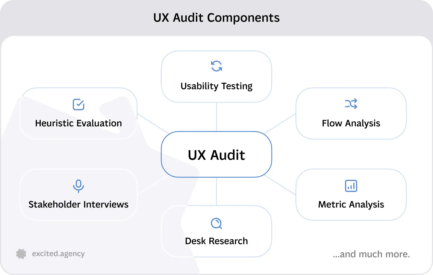
The Ecommerce UX Audit Checklist, Page by Page
This is the working audit checklist. Go page type by page type. For each check, record what you found, how severe it is, and which metric it should move.
Homepage and First Impression
The homepage has one job: get people into the right category fast.
- Is it obvious what you sell within three seconds, without scrolling?
- Does navigation reflect how customers think, or how your team is organised?
- Is search visible on first load, not hidden behind an icon?
- Are delivery cost and returns policy stated above the fold?
- Do promotional banners push real products below the fold?
- Does the page load in under three seconds on a mid-range phone?
Category and Product Listing Pages
This is where most browsing happens and where most audits find quick wins.
- Can users filter by the attributes they actually care about, such as size, price, and availability?
- Do filters persist when someone views a product and comes back?
- Are out-of-stock items pushed down or still occupying prime positions?
- Does each card show enough to compare, meaning price, rating, and a second image on hover?
- Is the default sort sensible for the category?
- Does pagination or lazy loading preserve position on back navigation?
Product Page
The product page is where the decision happens and where trust signals do the heavy lifting.
- Do images show scale, texture, and the product in use?
- Is the price, including any delivery estimate, visible without scrolling?
- Are reviews present, recent, and filterable?
- Is stock status honest and specific?
- Is the add to cart button fixed on mobile as the user scrolls?
- Are size, fit, or compatibility questions answered on the page rather than in a support ticket?
- Is the returns policy one click away, not buried in the footer?
Cart
- Does the cart show delivery cost before checkout begins?
- Can quantity be changed and items removed without a page reload?
- Is there a clear path back to browsing that does not lose the cart?
- Are discount code fields prominent enough to be useful but not so prominent they trigger coupon hunting?
- Does the cart persist across sessions and devices?
Checkout
Checkout is the highest value part of any ecommerce UX audit. Small friction here costs real money.
Research: Baymard Institute's long-running aggregate of cart abandonment studies puts the average documented abandonment rate close to 70%. A significant share of that is driven by checkout friction and unexpected costs rather than by price itself.
- Is guest checkout offered without a hunt for it?
- How many fields are required, and can any be removed or auto-filled?
- Are errors shown inline, next to the field, in plain language?
- Are all costs, including tax and delivery, shown before the final step?
- Are payment methods appropriate for the market, including local wallets?
- Does the progress indicator match the real number of steps?
- Does the form work with password managers and browser autofill?
Mobile Experience
Audit mobile as its own experience. Most stores now take the majority of their traffic there.
- Are tap targets large enough and spaced apart?
- Do sticky elements eat the viewport on small screens?
- Does the keyboard type match the field, such as numeric for card entry?
- Are modals dismissible with one clear action?
- Does the page hold its position when images finish loading?
Post-Purchase
The experience after payment drives repeat orders and support volume.
- Is the confirmation clear about what happens next and when?
- Is order tracking reachable without logging in?
- Is the returns process explained before the customer has to ask?
- Does the account area let people reorder in one or two clicks?
How Do You Conduct a UX Audit, Step by Step?
A UX audit is conducted in five steps: define goals and pull data, run a heuristic evaluation, benchmark against competitors, validate findings with usability testing, then prioritise fixes by impact and effort. The sequence matters. Opinions formed before the data are just opinions.
Step 1. Define Goals and Pull the Data
Start with the commercial question. Are you trying to lift checkout completion, raise average order value, or cut support tickets? The answer sets the scope.
Then gather evidence. Pull funnel drop-off from analytics, segmented by device. Add heatmaps to see what people click and how far they scroll. Watch session recordings of abandoned checkouts, not successful ones. Read support tickets and on-site search queries, which are the cheapest source of unmet need in any ecommerce store.

Step 2. Run a Heuristic Evaluation
A heuristic evaluation is a structured expert review that scores an interface against a fixed set of usability principles rather than personal taste. Two or three auditors reviewing independently, then reconciling, will catch far more than one. We cover the general method in more depth in our UX audit checklist.
Research: Nielsen Norman Group's ten usability heuristics remain the most widely used framework for expert review. They are deliberately general, which is why ecommerce audits pair them with channel-specific best practice for cart, checkout, and product discovery.
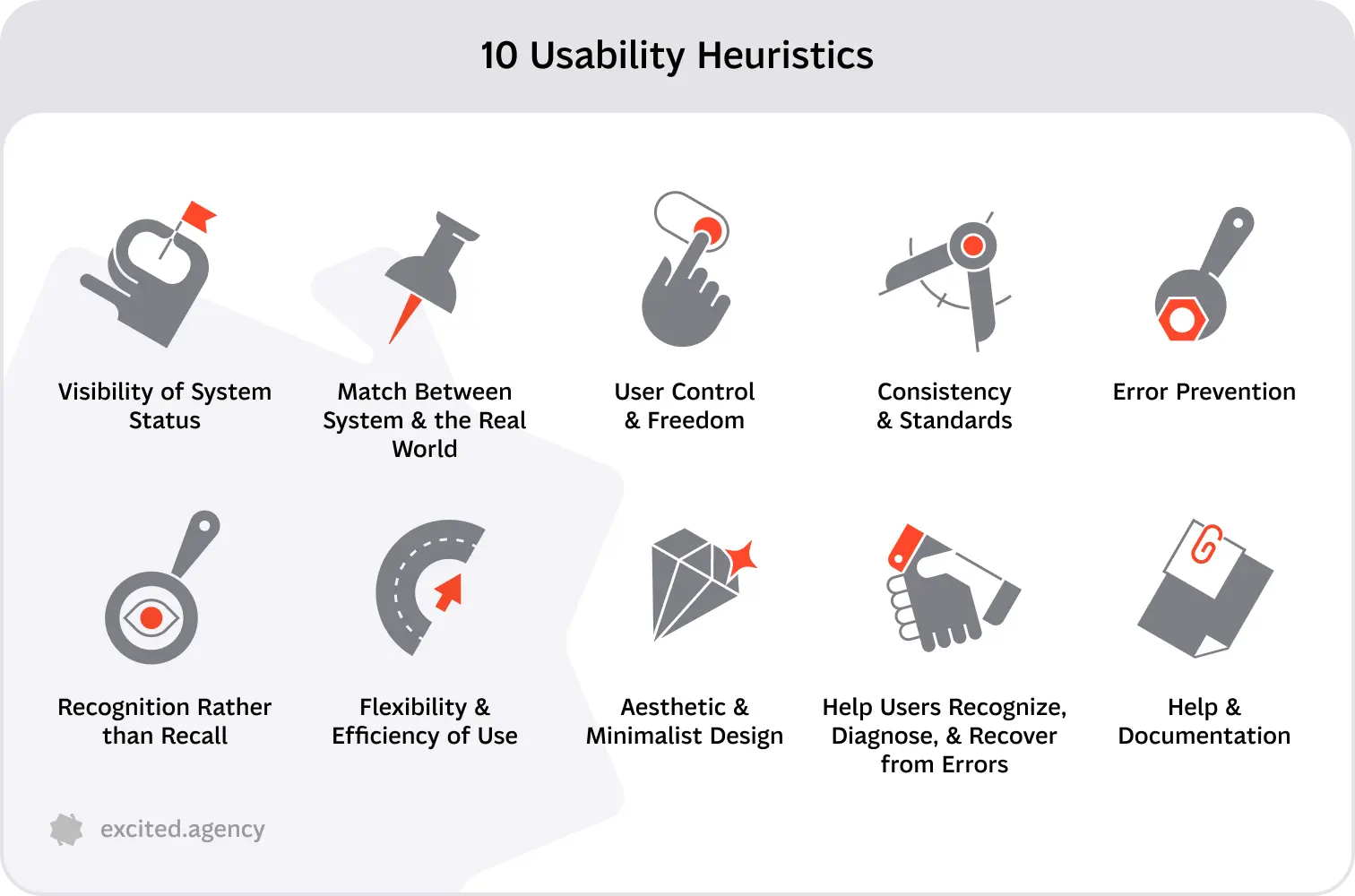
Score each issue for severity. A cosmetic inconsistency and a broken payment step should never sit at the same level in your audit report.
Step 3. Benchmark Against Competitors
Benchmark the same flows on three or four competitors. Do not copy their design. Look for conventions your customers have already learned elsewhere, because breaking a familiar pattern costs you conversions even when your version is objectively nicer.
Pay attention to what the category leaders do at checkout. That is where convention is strongest and deviation is most expensive.

Step 4. Validate With Usability Testing
Heuristics predict problems. Usability testing confirms them. Five to eight participants attempting a realistic purchase will surface the issues that matter most.

Give tasks, not instructions. "Buy a gift for a friend under fifty pounds" produces real behaviour. "Click the filter menu" does not.
Step 5. Prioritize Findings by Impact and Effort
Score every issue on two axes: expected impact on conversion and implementation effort. Plot them. Fix the high impact, low effort items first, ship them, and measure before moving on.
An audit that ends with two hundred undifferentiated notes is a document nobody will action. An audit that ends with twelve ranked fixes and an owner for each is a plan.
What Goes Into a UX Audit Report?
A useful audit report is built to be worked from, not admired. It contains the following.
- Executive summary. The three findings that matter most, in business language.
- Scorecard. Each page type or flow rated, so progress can be re-measured later.
- Issue list. Every finding with a screenshot, the heuristic or data point behind it, severity, and the affected metric.
- Recommendation per issue. What to change, described clearly enough that a designer or developer can act without a meeting.
- Prioritised roadmap. Sequenced by impact and effort, with rough estimates.
- Measurement plan. Which metric proves each fix worked, and when to check.
.webp)
If the report cannot be handed to a developer and turned into tickets the same week, it is not finished.
What Tools Do You Need for a UX Audit?
You need less tooling than most people assume. Four categories cover it.
| Category | Purpose | Common options |
|---|---|---|
| Analytics | Funnel drop-off, device and segment splits | GA4, Shopify analytics, Piwik Pro |
| Behaviour | Heatmaps, scroll depth, session recordings | Hotjar, Microsoft Clarity, FullStory |
| Testing | Moderated and unmoderated usability testing | Maze, UserTesting, Lookback |
| Benchmarks | Documented ecommerce best practice | Baymard, competitor teardowns |
Microsoft Clarity is free and covers heatmaps and session recordings, which makes it the fastest way to start if you have no behavioural tooling at all.
How Much Does an Ecommerce UX Audit Cost?
Ecommerce UX audit cost ranges from nothing to fifty thousand and up, depending on who runs it and how deep it goes. The tiers are fairly predictable.
| Tier | Typical cost | What you get | Best for |
|---|---|---|---|
| DIY | Time only | Checklist review by your own team | Small stores, first pass |
| Freelance auditor | $500 to $4,000 | Expert review, written findings | Single flow or small catalogue |
| Specialist studio | $2,500 to $15,000 | Full audit, data, testing, roadmap | Most growing ecommerce brands |
| Large agency | $10,000 to $50,000+ | Audit inside a wider engagement | Enterprise, multi-market stores |
DIY is not free. It costs senior time, and it carries a blind spot: your team already knows where everything is, so it cannot see what confuses a first-time visitor.
Working Out the ROI Before You Spend
The maths is simple enough to do on a napkin. Multiply monthly sessions by current conversion rate by average order value to get baseline revenue. Then model a conservative lift.
Take a store with 100,000 monthly sessions, a 1.8% conversion rate, and a $70 average order value. That is $126,000 a month. A 0.2 percentage point lift, which is modest for a store that has never been audited, adds roughly $14,000 a month. Against a $6,000 audit, the payback period is under two weeks of trading.
Run this calculation with your own numbers before you brief anyone. If the arithmetic does not work at a conservative lift, the audit is not the right spend right now.
Should You Run the Audit Yourself or Hire a UX Audit Expert?
Run it yourself when the scope is narrow, the store is small, and you mainly need a sanity check. The checklist above will get you a long way in a focused day.
Hire an expert when the stakes are higher than the fee. That usually means a redesign is coming, a migration is planned, or conversion has dropped and nobody can explain why. An outside auditor brings pattern recognition across many stores and, more importantly, has never used your site before.
The honest test: if a 0.2 point conversion lift would pay for the audit several times over, hiring is the rational choice.
What Are the Most Common UX Audit Mistakes?
- Auditing on opinion. No analytics, no recordings, just preferences. The findings will not survive their first stakeholder meeting.
- Two hundred findings, no priorities. Volume looks thorough and prevents action.
- Cosmetic fixes over flow fixes. Button colours are easier to change than a broken checkout, so teams do the easy thing.
- Ignoring mobile. Auditing on a desktop monitor while most revenue arrives on phones.
- No re-measurement. If you never check the metric after shipping, you never learn which fixes worked.
- Confusing preference with usability. Users saying they like something is not the same as users completing the task.
Turn Audit Findings Into Revenue
The value of an ecommerce UX audit is not the document. It is the first three fixes you ship and measure. Start with checkout, because that is where the money is closest to the door, then work down your prioritised list and re-measure as you go.
If you want an outside read on where your store is leaking, our team runs ecommerce UX audits that end in a ranked roadmap rather than a list of opinions. We also handle the ecommerce design work that follows.
Service short description
Frequently Asked Questions
Sources
50 Cart Abandonment Rate Statistics 2026
10 Usability Heuristics for User Interface Design
Why You Only Need to Test with 5 Users
How to Conduct a UX Audit [A Checklist]
Mobile App Usability Testing: A Practical Guide & Testing Tools
How to Increase Sales with UX Design: Better UX for Better Conversion