

Design in healthcare isn’t just “good UI.” It never was. Probably, never will be. When you’re working across healthcare — from a patient portal to clinician-facing healthcare software — your UX decisions can influence clarity, speed, safety, trust and quite literaly someone's wellbeing. In other words: UX in healthcare has a higher bar than most industries, because the context is real people, real stress, and consequences that are very real and tangible.
This guide explains what healthcare UX design is, why it’s uniquely challenging, and how to approach designing digital health products that support patients, clinicians, and the systems around them.
Without further ado, let's get into the article.
What is healthcare UX?
At its core, UX design in healthcare is the craft of making healthcare digital products understandable and usable for the people who rely on them. This includes patients, clinicians, and broader healthcare professionals. A practical way to frame medical UX is through three components or levels: utility, usability, and desirability.
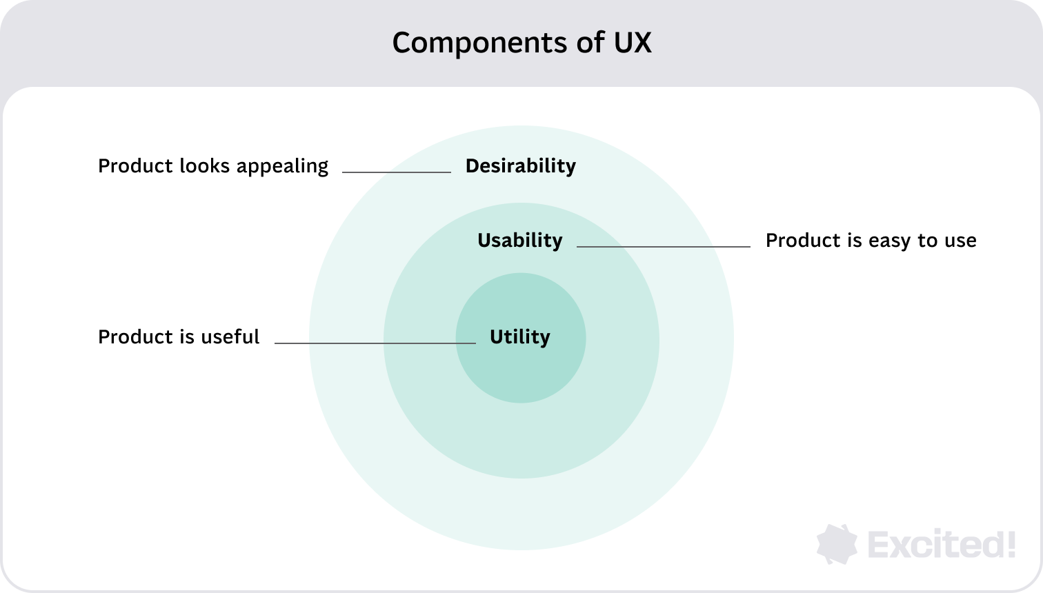
Utility is whether the product actually helps users do the job. In a healthcare system, “the job” might be a nurse documenting patient information quickly, administrative staff handling scheduling, or a patient reviewing lab results and understanding what to do next. Simply put, first and foremost a product needs to be useful.
Usability is how easily people can complete those tasks, especially under pressure. Think ER triage, post-op monitoring, or a caregiver using a health app one-handed at 2am. In healthcare technology, usability is tightly tied to error prevention, clarity, and predictability. While usability is paramount, no amount of ease-of-use can compensate for a product that has no utility.
Desirability is the part people underestimate in healthcare UX. It’s not about making something “pretty.” It’s about trust, calmness, and confidence. If a patient dashboard feels chaotic or a diagnostic flow feels confusing, users hesitate. In healthcare, desirability often equals reduced anxiety and lower cognitive load.
{{{{service-card}}}}
Why demand for healthcare UX is growing
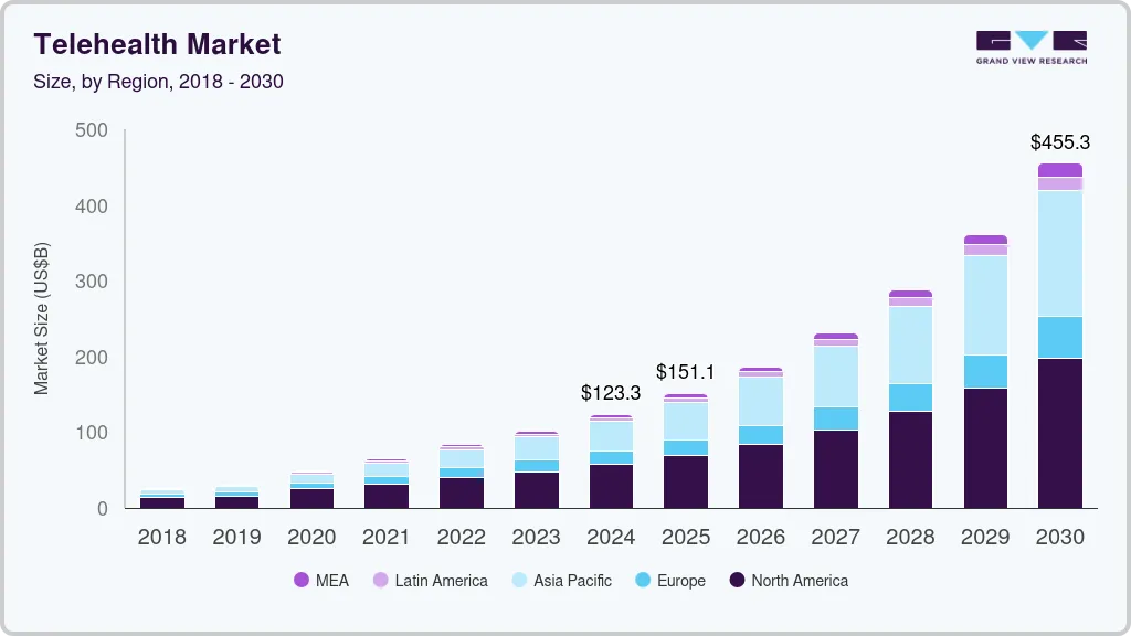
There’s an increasing number of digital products within healthcare, which makes design in healthcare more important than ever. Telehealth services, patient monitoring tools, and AI-driven healthcare experiences are becoming normal expectations, not optional innovation.
That shift also changes how teams approach user-centered design. You’re not designing one screen. You’re designing an ecosystem that spans hospitals and clinics, home devices, and privacy and regulatory constraints.
The unique challenges of UX design in healthcare
All industries are distinct. Healthcare, on the other hand, even more so. Let's cover some of the industry paculiarities that have a major impact on design decisions.
Multiple user groups with different needs
Healthcare providers include many user groups of different ages and roles, such as nurses, administrators, doctors, and more. Patients are also diverse, often skewing older. A single product may need role-specific modes: high-density dashboards for clinicians, simplified flows for patients, and operational tools for administrative staff and stakeholders.
{{case-study}}
Inclusive design is mandatory
Healthcare experiences must work for people with vision, mobility, and cognition impairments. Inclusive design isn’t an accessibility checklist at the end, it shapes navigation, typography, contrast, data visualization, and content structure from day one.
Poor UX can cause tangible harm
In healthcare, mistakes don’t only lead to frustration. They may cause real harm to patients and create major strain for providers.
This is especially true for patients navigating a serious diagnosis, who may rely on digital health tools to understand complex treatment options, interpret test results, and coordinate care across multiple specialists. For these users, a confusing interface is not an inconvenience. It can directly delay critical decisions.
That’s why healthcare UX design leans heavily on guardrails, clear confirmations, safe defaults, and testing in realistic conditions.
Data visualization is a safety feature
Proper data visualization is vital for understanding complex information and making decisions for both doctors and patients. Healthcare solutions constantly handle patient data and health data. If dashboards bury meaning behind clutter, the product stops being helpful, no matter how polished the UI looks.
The future of UX in healthcare
Digital health is reshaping expectations across the entire healthcare sector. Patients now assume there will be a patient portal, that telehealth services will be accessible, and that their patient information won’t get lost between systems. This isn’t just a product shift, it’s a behavior shift.
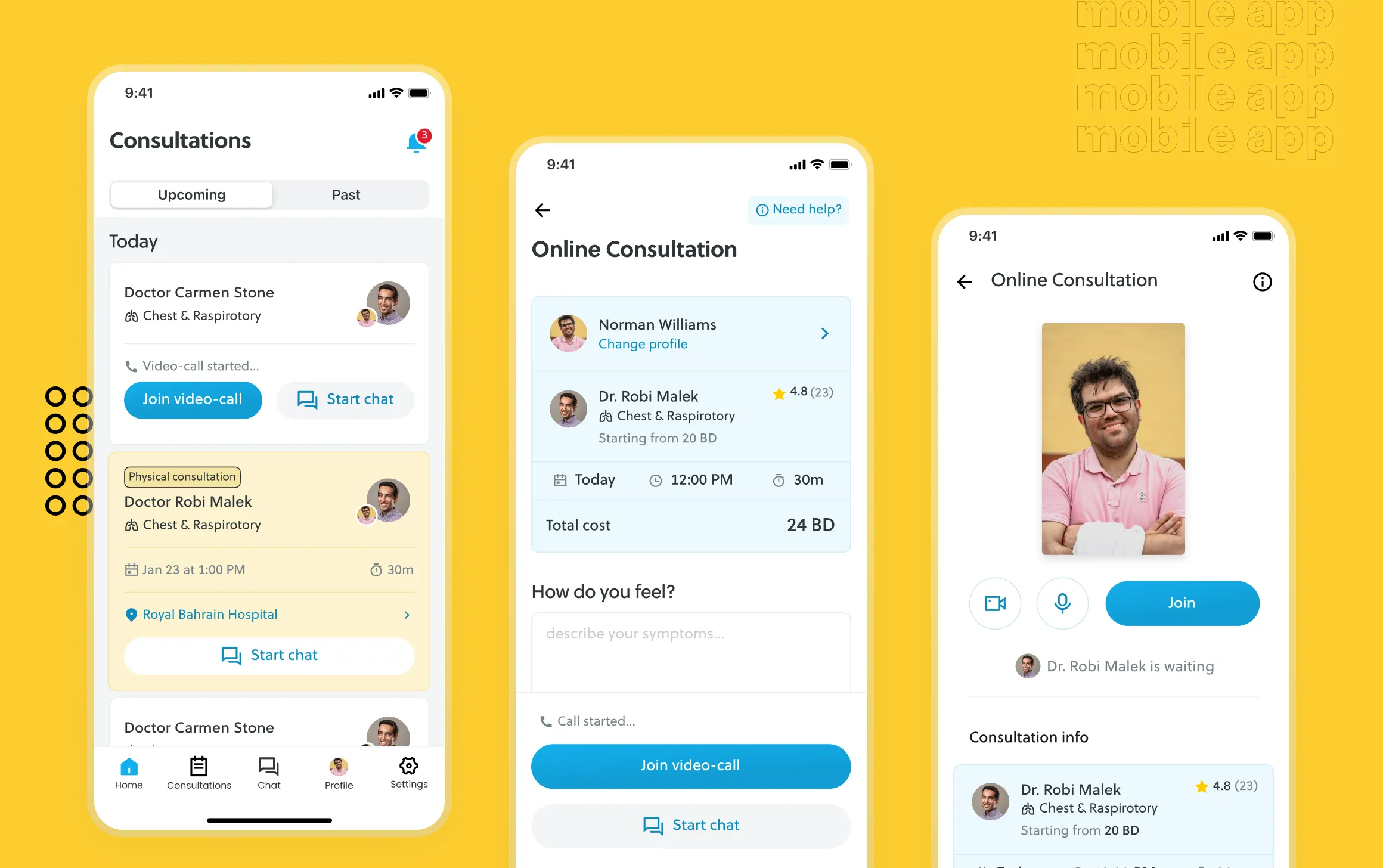
Telehealth services are full journeys, not video calls
Designing telehealth means designing the end-to-end experience: finding care, describing symptoms, scheduling, the visit itself, and follow-ups like prescriptions, care plans, or next steps. The call is only one moment. The real UX work often lives in what happens before and after.
Wearables and patient monitoring push healthcare toward continuous care
Wearables and remote monitoring create a new UX challenge: how to turn streams of health data into decisions people can act on. For clinicians, that means prioritization and speed. For patients, it means confidence and clarity: what changed, what it means, and what to do about it.
AI-driven healthcare needs transparent UX
AI can improve healthcare solutions, but only if UX makes it understandable. AI is most useful when it drafts summaries, flags anomalies with context, suggests next steps with clear confidence signals, and reduces repetitive admin work. The UX job is to avoid blind trust and avoid panic. Users should always know what the AI did, why it did it, and what they can do next. All major health decisions should be based on professional opinion, not just AI.
How to design a healthcare product
Good healthcare UX starts with clarity on users, workflows, and risk, before you ever touch UI. Let's break this down into more digestible tips.
Start with users and “can’t-fail” moments
Get unreasonably clear on who the real users are (often patients and clinicians, plus administrative staff and stakeholders), what success means for each role, and where mistakes are unacceptable (identity, medications, clinical decision support, or critical patient data). To do that, we highly recommend you get into the habit of conducting routine user interviews.
Map the workflow before screens
A healthcare product is rarely standalone. It’s part of a larger system with handoffs, legacy tools, and constraints. Map how patient information is created, where it travels, where it’s interpreted, and where it breaks (double entry, missing context, inconsistent tools). Workflow mapping reveals the “invisible” UX problems that screen-based design often misses.
Mapping the entire workflow is easier said than done. It requires consulting numerous healthcare professionals among numerous positions. Aditionally, professionals who have a good graps of the whole system are hard to come by.
Define role-based jobs to be done
Healthcare UX succeeds when it respects role differences. Clinicians need dense, fast interfaces that reduce errors and surface context. Patients need plain language and clear next steps. Admin teams need throughput and repeatable actions. Role-based UX helps avoid building one experience that kinda-sorta works for nobody.
Design information architecture around “What happens next?”
In patient-centered design, every screen should answer: What does this mean? Is it good or bad? What should I do next? Who can I contact? That’s how you turn health data into action without overwhelming the user. In other words, users need clarity. Confusion is the ultimate enemy.
Build UI for stress, not ideal conditions
Healthcare users often interact with products while tired, interrupted, or anxious. Bias your UI toward fewer decisions per screen, clear hierarchy, explicit confirmations for risky actions, resilient error handling, and consistent patterns. A strong design system helps here, especially when you need to support both dense clinician dashboards and simpler patient flows.
Make dashboards about decisions, not data
A dashboard should help someone decide quickly. Define the decision first, then design the visualization around it. For clinicians, it might be “who needs attention now.” For patients, it might be “is this trend normal, and what should I do next.”
Test like real life
Healthcare user testing should reflect reality: interruptions, time pressure, incomplete data, device switching, and accessibility needs. Polished prototypes tested in calm conditions often hide the friction that matters most.
Treat privacy and compliance as UX requirements
Healthcare privacy laws and regulations shape what users can see, share, and do. Consent, access boundaries, and auditability aren’t “legal footnotes”—they’re part of the experience. When privacy behavior feels surprising, trust collapses quickly, even if you’re technically compliant. Behind the scenes, organizations often rely on enterprise security software to enforce these standards while maintaining a seamless and trustworthy user experience.
Parting thoughts
Healthcare UX design ultimately comes down to responsibility. When digital health products are designed with real workflows, real users, and real risks in mind, they can reduce friction, improve clinical efficiency, and help patients feel more confident in their care.
As healthcare continues to become more digital, the role of thoughtful UX will only grow. The teams that succeed will be the ones that treat design not as decoration, but as infrastructure; something that supports clarity, safety, and better decisions across the entire healthcare experience.
Service short description
Frequently Asked Questions
Sources
Effective Dashboard UX: Design Principles & Best Practices
Mobile App Usability Testing: A Practical Guide & Testing Tools
Churn Rate vs. Customer Retention Rate: How to Calculate and Understand Churn
Medical Usability: How to Kill Patients Through Bad Design